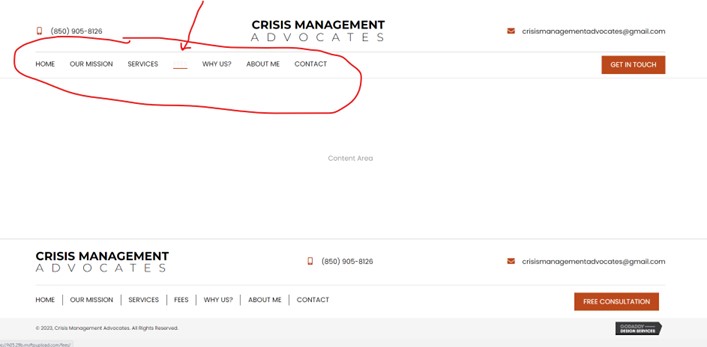
Hover/active in nav menu has poor contrast or poor color pairing
- “Poor Contrast” means the text color is too similar to the background color, which makes the text difficult to read.
- “Poor Color Pairing” means the color clashes with the rest of the colors on the site.
- Color(s) do not go with the theme usedA color that was requested was not used
- A color was used that was specifically requested NOT to be used.
- Any color combinations are going to need to be marked as a “pass” for text 17pt and below, text 18pt and above / 14pt bold and above, and icons and actionable graphics. The minimum overall contrast ratio that is passable is 4.5 : 1.
Example:
- Poor Navigation link hover coloring: