Skip to content

How to use Demo Gallery as a Showcase

The Demo Gallery is a resource for anyone outside the design or development teams to explore and understand specific areas of the website build process. It demonstrates how sections align with our latest quality standards, offering insights into design patterns, usability, and implementation practices.

The latest version of GoDaddy Figma Library can be downloaded from this link.

Purpose of the Demo Gallery as a Showcase

The Demo Gallery provides a hands-on way to explore the building blocks of our websites. It demonstrates how individual sections and modules are designed, developed, and implemented with a focus on quality, usability, and consistency. As a showcase, the Demo Gallery helps:

Bridge Gaps Across Teams:
Provides non-technical team members with visual examples of what the design and development teams produce, making technical concepts more accessible.

Promote Transparency:
Offers a clear view of how quality standards are applied to each section, from typography and spacing to responsiveness and interactivity.

Serve as an Educational Tool:
Helps team members or potential customers learn about effective design patterns, best practices, and how design decisions are implemented.

Who Can Benefit from the Demo Gallery?

Marketing and Content Teams:
Use the Demo Gallery to understand how content will appear on live pages. This can help align messaging and visuals with brand goals.

Clients:
The Demo Gallery serves as a preview of completed sections, allowing clients to review design and functionality without requiring access to technical tools like Figma or development environments.

Team Members Across Departments:
For those not directly involved in design or development, the Demo Gallery offers a clear way to familiarize themselves with our website standards and how they’re applied.

Key Features of the Demo Gallery

QA-Approved Sections:
Every section in the Demo Gallery adheres to our latest quality standards, ensuring accessibility, consistency, and responsiveness.

Interactive Exploration:
Users can navigate through different sections to see how design and functionality come together.

Real-World Examples:
Demonstrates how components like hero sections, feature blocks, and CTAs work cohesively, providing inspiration and clarity for projects.

How to Use the Demo Gallery

Explore Sections by Category:
Browse through categories such as hero sections, text blocks, and feature grids. Each section is labeled for easy navigation and reference.

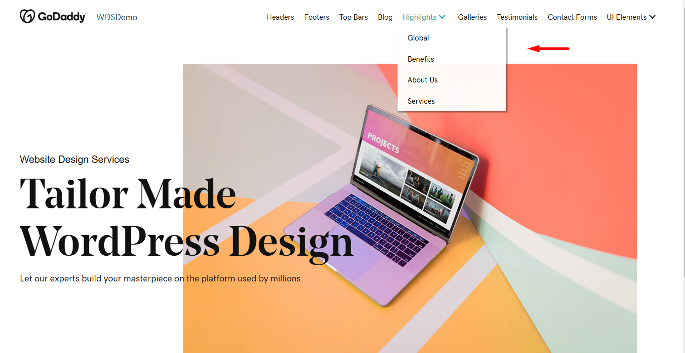
Demo Site
Demo Site

Analyze Design Patterns:
Pay attention to the layout, spacing, and alignment within sections. Note how these elements maintain consistency and follow usability best practices.

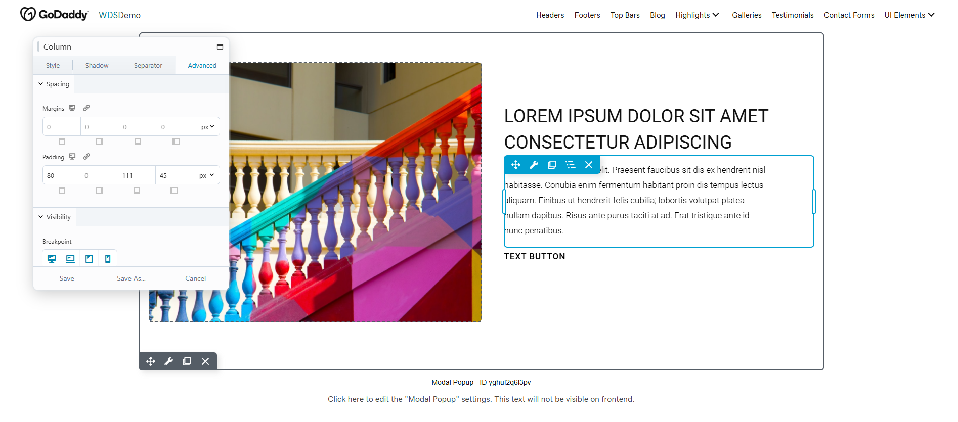
Using Beaver Builder

Check for Standards:
Compare sections with brand guidelines and QA standards to see how each element adheres to predefined rules for typography, colors, and responsiveness.

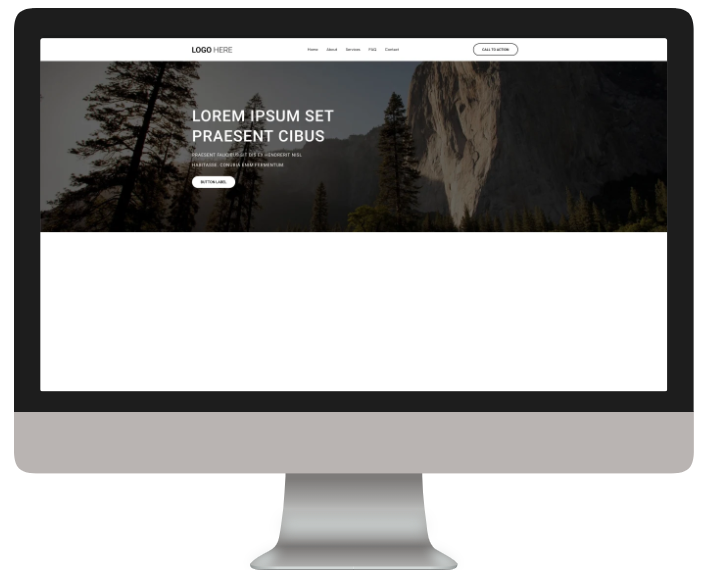
Header and Hero Section
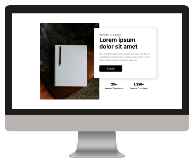
About Us Section
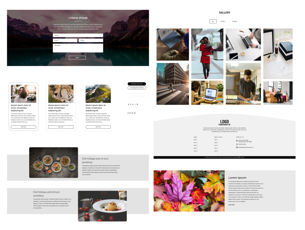
About Us Section

Use for Reference:
Whether brainstorming ideas, reviewing work, or presenting concepts to customers, use the Demo Gallery to showcase quality-approved examples.

Demo Gallery Elements
Table of Contents
    Scroll To Top