How to use Demo Gallery as a Developer (Website Builder)
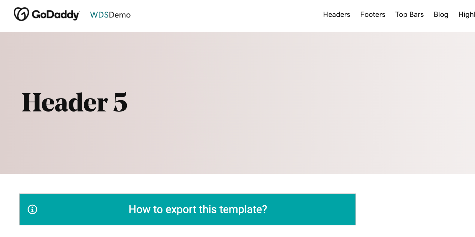
The Demo Gallery acts as a tangible blueprint of the Figma Library’s elements, showcasing how they translate to fully functional web components. Developers can access and modify these elements directly within Beaver Builder, ensuring fidelity between the design and the final implementation.
How the workflow operates
After the designers finalize the Figma mockup using the pre-built library modules, the process transitions to the developers (Website Builders). This stage bridges the gap between design and development, ensuring that the envisioned design is efficiently translated into a functional website.
Annotated Figma Design for Developers
Accessing the Demo Gallery
Searching for the Required Module
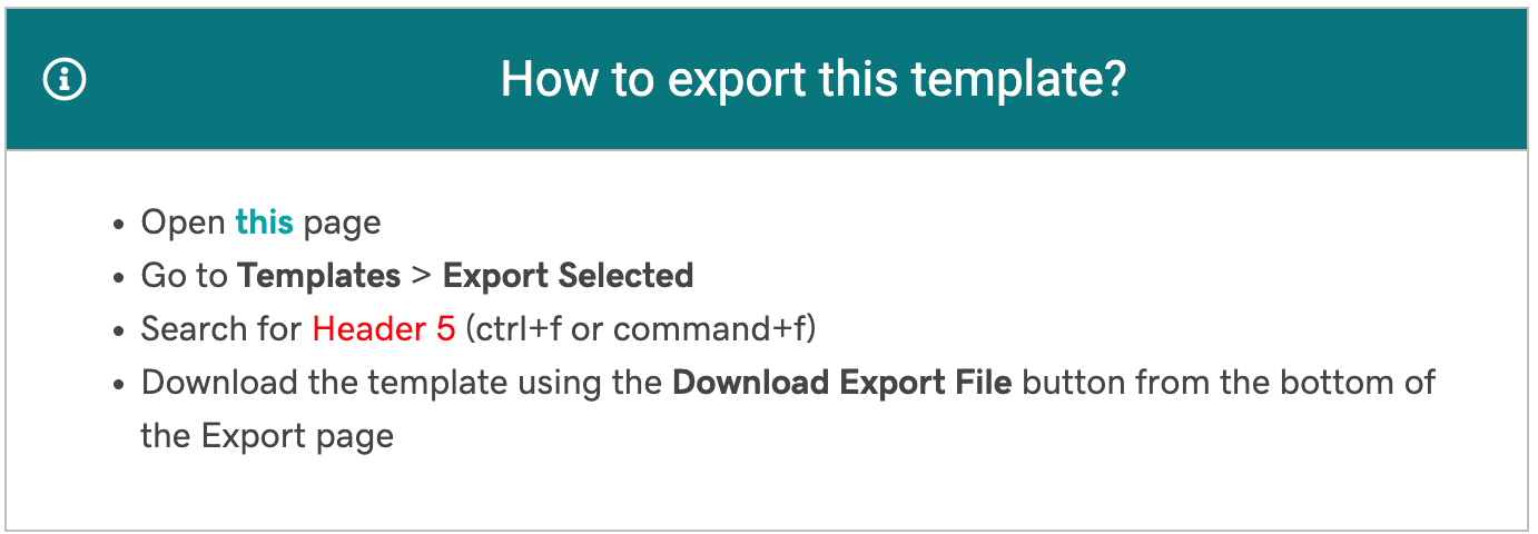
Exporting the Pre-Built Beaver Builder Section


Importing and Customizing the Module
- Adjust fonts, colors, or images.
- Refine spacing, paddings, and alignments.
- Add any functional elements (e.g., links, animations) that were defined in the design mockup.
Table of Contents
