Header Styles
Use the information on the "Using Discretion" page to determine which header styles work best with what the customer wants in the header. Based on the logo & color scheme, headers can range from transparent to translucent if set to overlay the hero image.
Header 1
Simple header layout, menu floated right
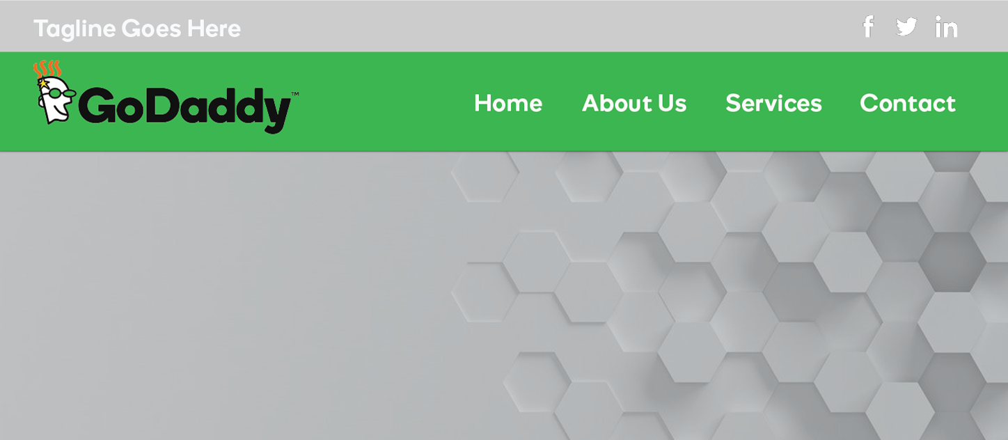
Website Header
Features: tagline, social icons, logo image/site title, menu
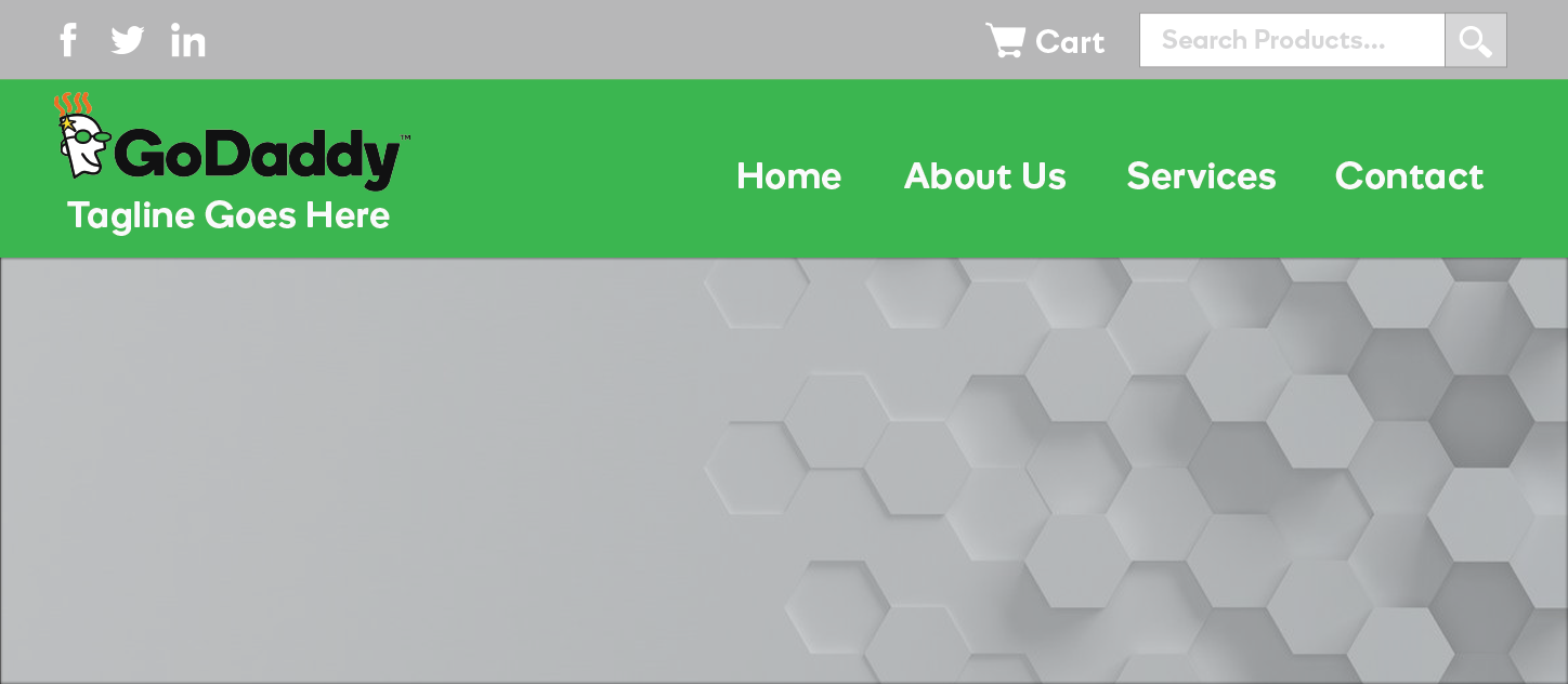
Woo Header
Features: woo cart, product search, tagline, social icons, logo/site title, menu
Ideal for menus shorter in length with about maximum 5 single-word navigation links
Header 2
Simple header layout, menu stacked
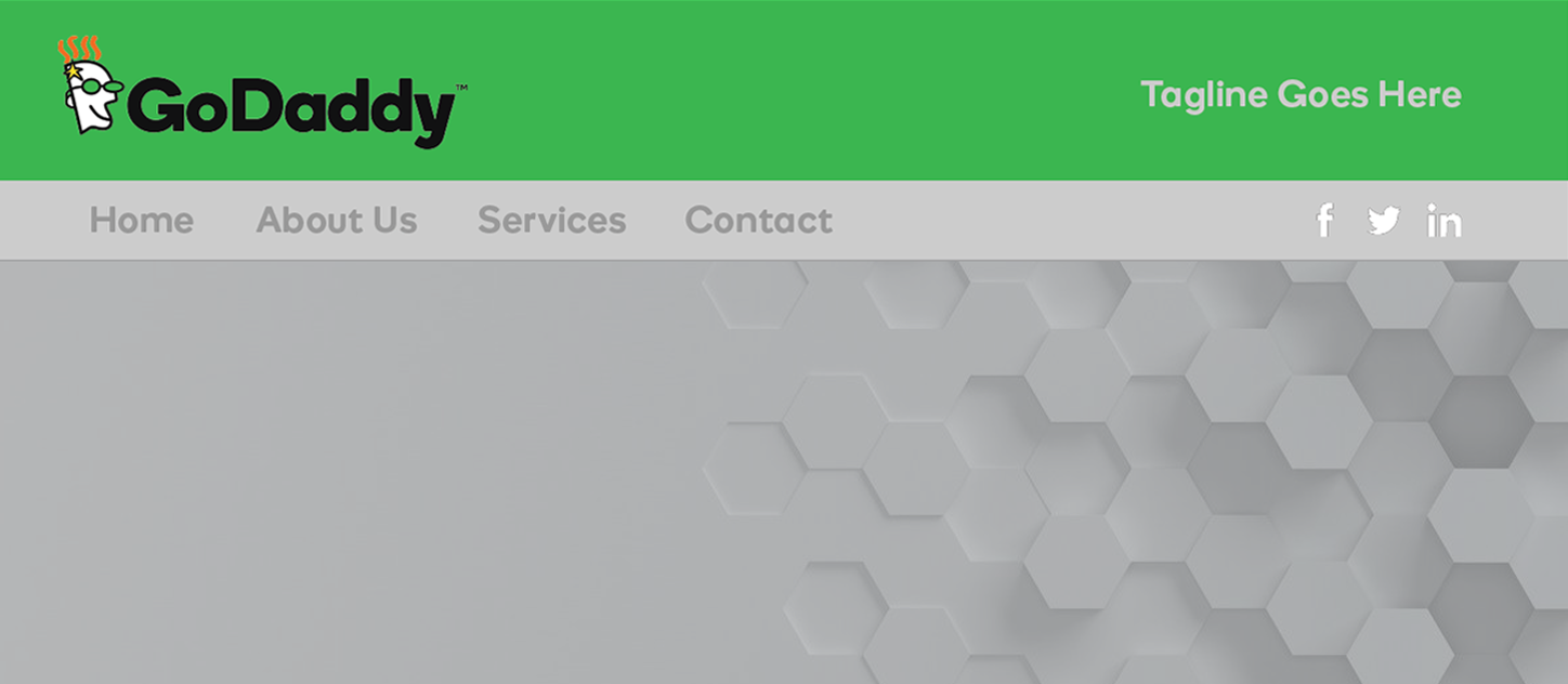
Website Header
Features: logo image/site title, tagline, menu, social icons
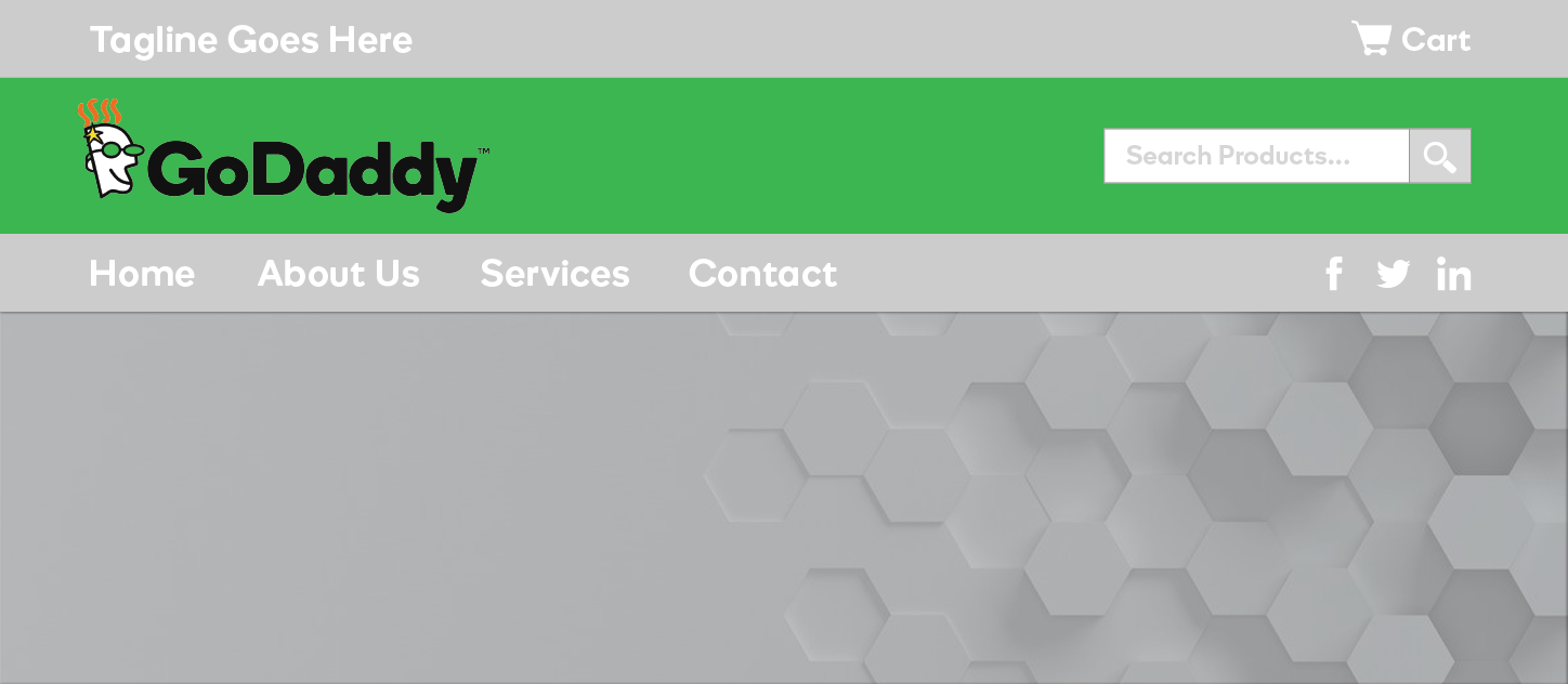
Woo Header
Features: woo cart, product search, logo/site title, tagline, menu, social icons
Better layout for menus with more than 5 navigation links, or for when navigation links are several characters long
Header 3
Content header layout, menu stacked
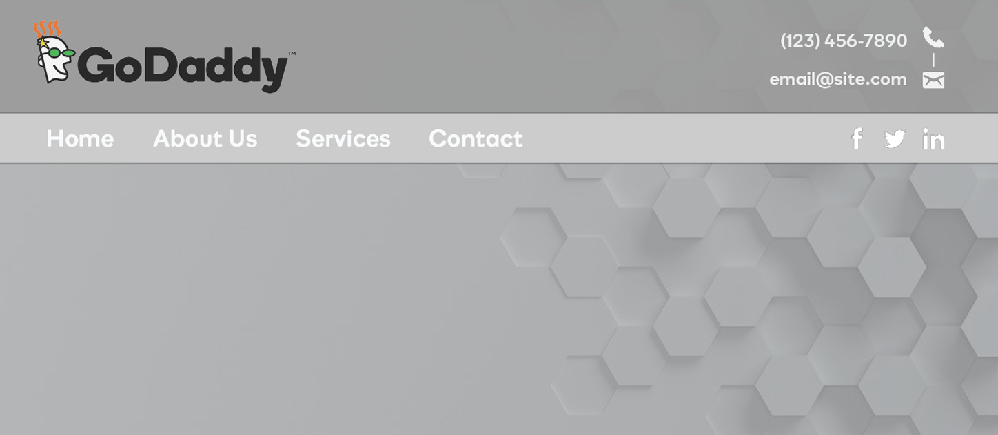
Website Header
Features: logo/site title, contact / custom CTA, menu, social icons
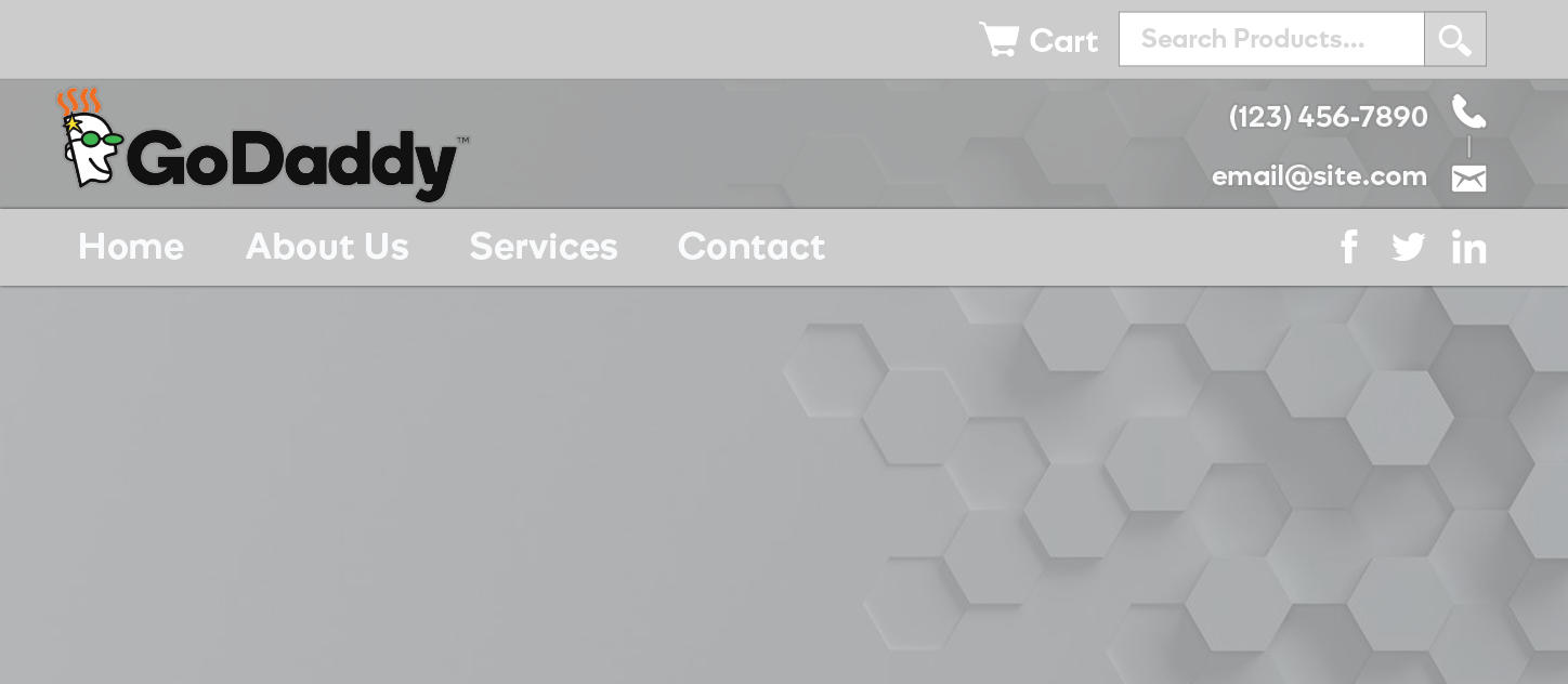
Woo Header
Features: woo cart, product search, logo/site title, contact / CTA, menu, social icons
Best for sites that require contact info or a call-to-action on all pages
Header 4
Minimalist header layout, menu floated right
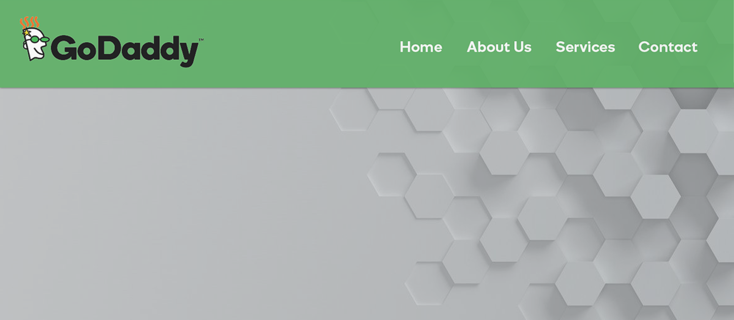
Website Header
Features: logo image /
site title, menu
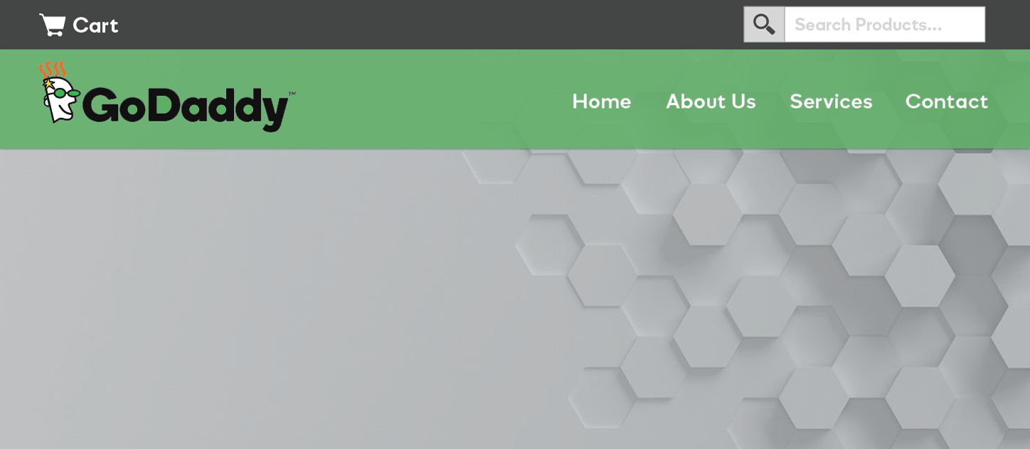
Woo Header
Features: woo cart, product search, logo image/site title, menu
Best for sites that want very simple headers with no additional content in them and have less than 5 single-word nav links
Header 5
Minimalist header layout, menu floated right
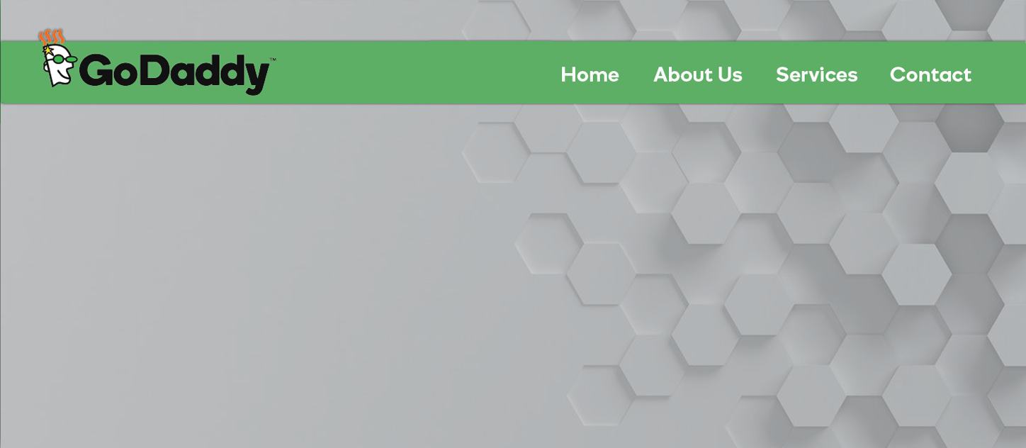
Website Header
Features: logo image /
site title, menu
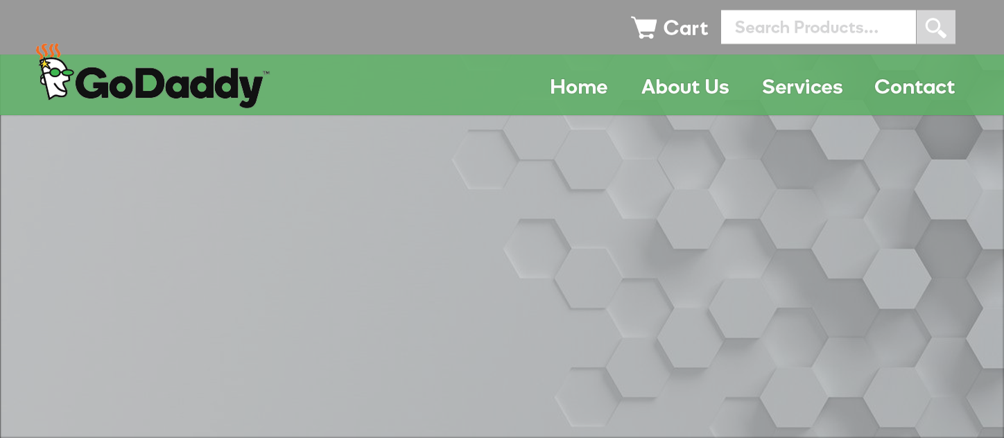
Woo Header
Features: woo cart, product search, logo image/site title, menu
Best for sites that want very simple headers with no additional content in them and have less than 5 single-word navigation links
Header 6
Content header layout, menu stacked at top
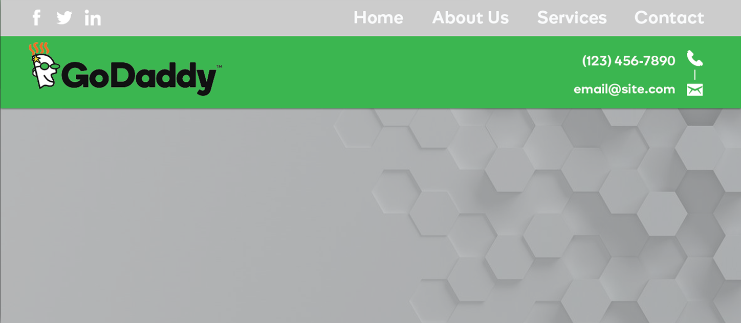
Website Header
Features: logo/site title, contact info/custom call-to-action, menu, social icons
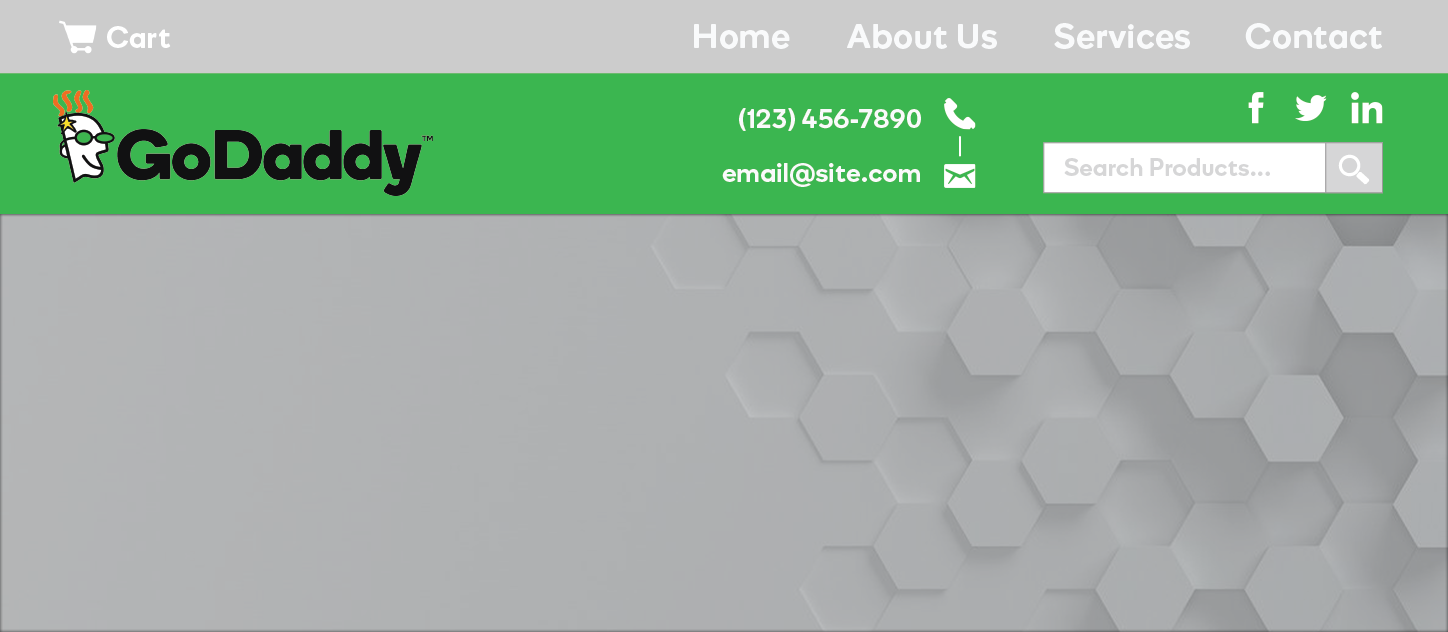
Woo Header
Features: woo cart, search, logo/site title, contact/CTA, menu, social icons
Best for sites that require contact info or a call-to-action on all pages
Header 7
Simple header split layout
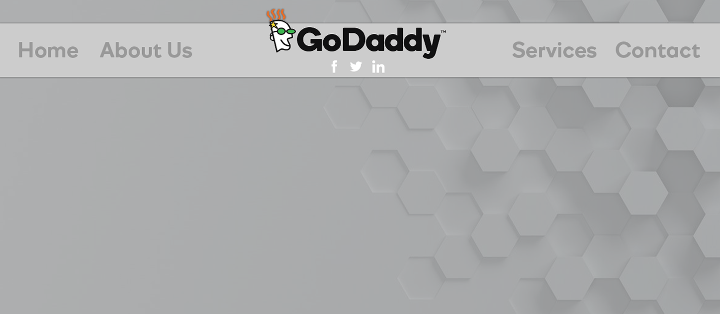
Website Header
Features: logo image/site title, tagline, social icons, menu
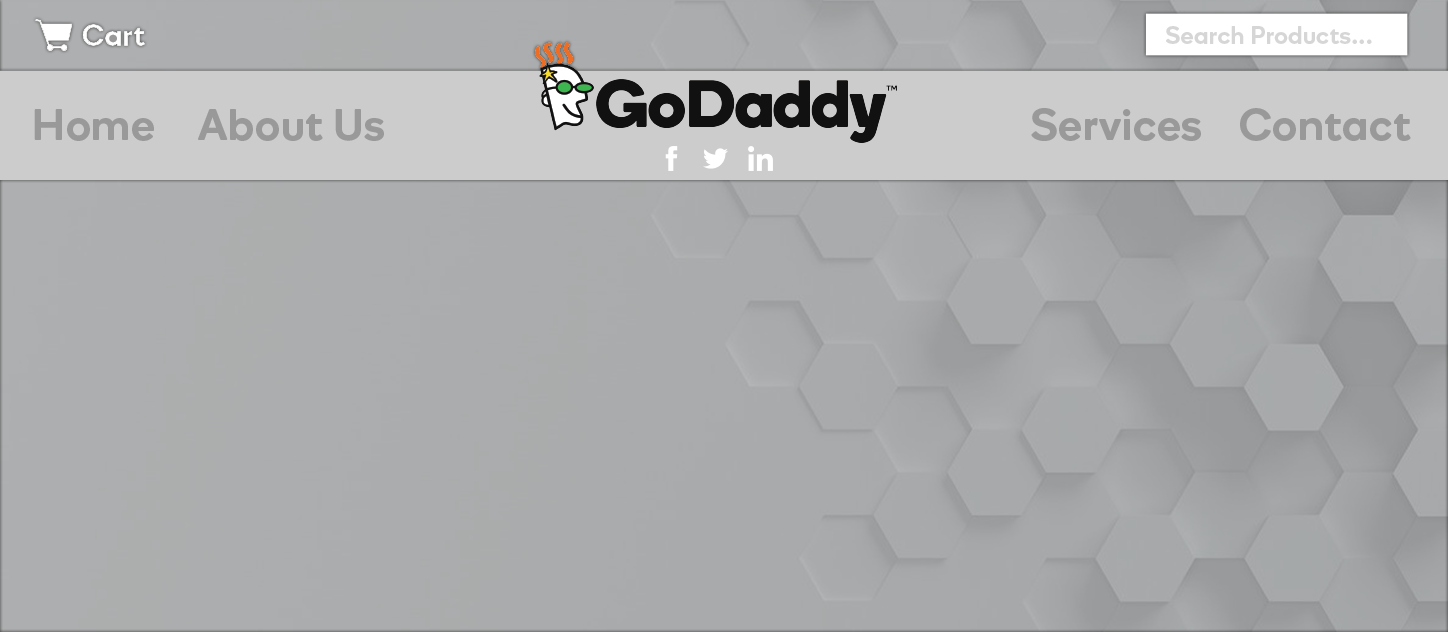
Woo Header
Features: woo cart, product search, logo image/site title, tagline, social icons, menu
Best for sites with larger/vertical logos, minimal header content, and an even number of single-word navigation links
- Make sure there are an equal number of single-word navigation links before selecting this header option. (no more than 3 navigation links on either side, the links on each side are similar in character length)
- Create 3 menus: the first menu "main" will contain all nav links, the second menu "main-1-half" will contain the first 2-3 links, and the third menu "main-2-half" will contain the last 2-3 links
- Choose "main-1-half" as the menu on the left-side, and "main-2-half" as the menu on the right
- For medium/small screens, this split header row is set to be hidden
- In themer builder view you'll see the row for small screens appear at the top (currently hidden on desktop) - for this row choose "main" as the menu
Header 8
Hero within header layout
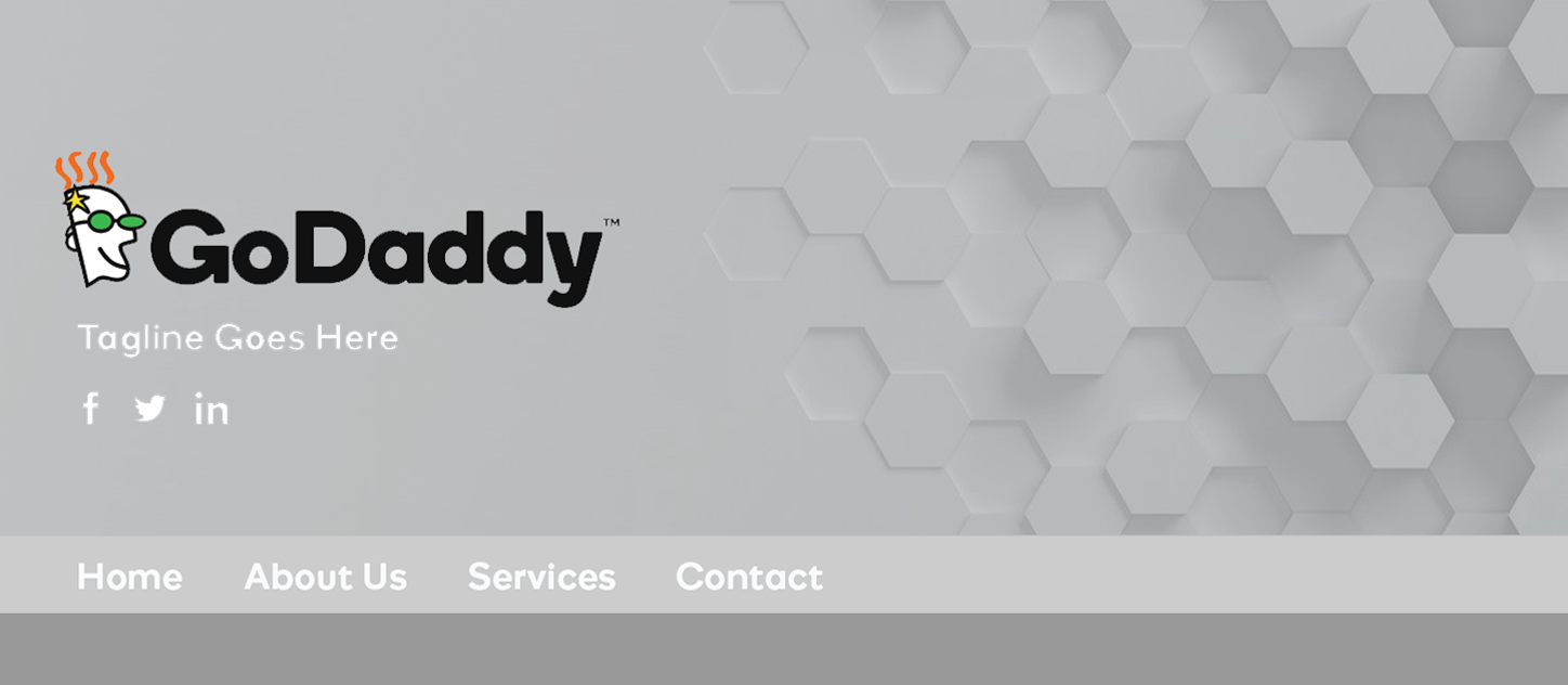
Website Header
Features: logo/site title, tagline, social icons, menu, hero image
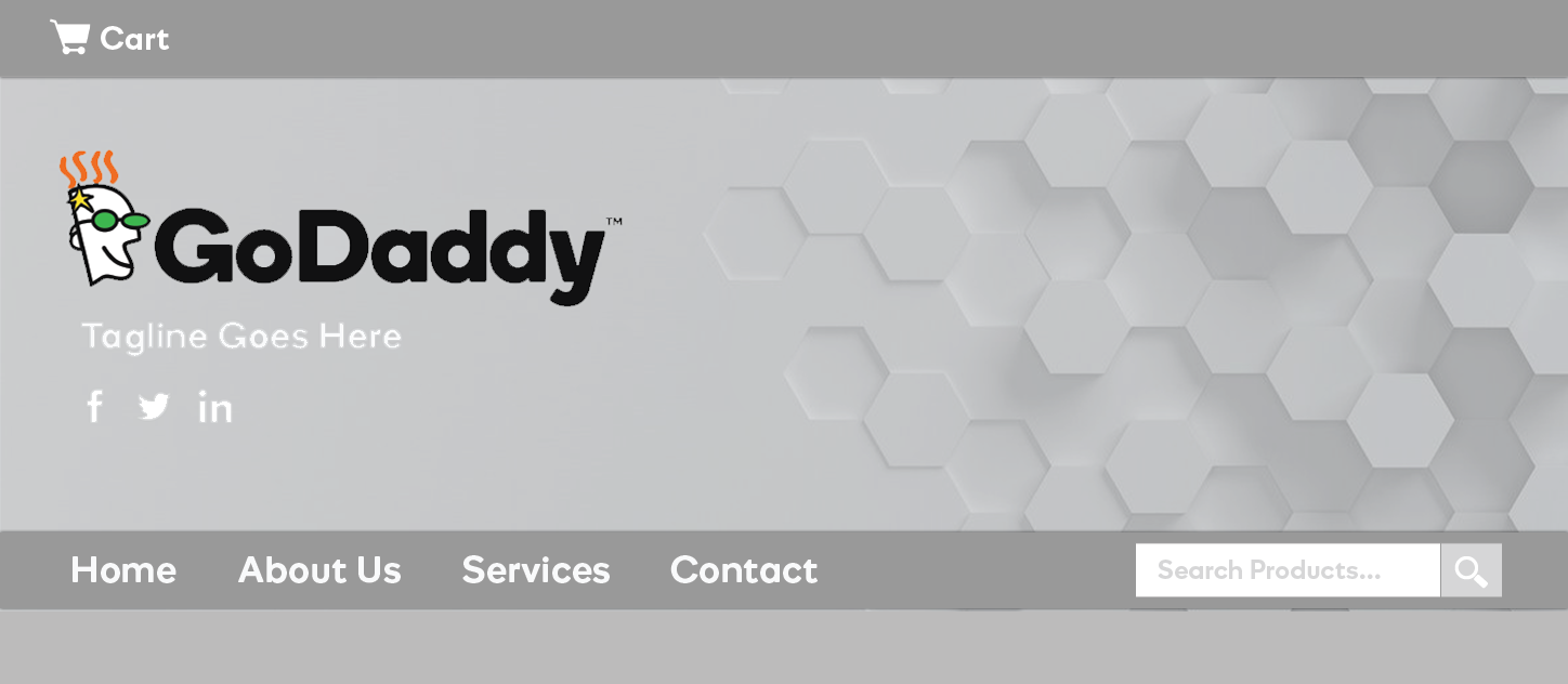
Woo Header
Features: woo cart, product search, logo image/site title, tagline, social icons, menu, hero image
This layout is best for when you wish to place the navigation below the hero image, or if you would like the hero image to be emphasized/consistent across all pages.
- Avoid this header option for all builds unless the customer only wants ONE hero image used across the site
- Only use this header if the logo and header information is not going to be washed out by the hero image in the header (in very few scenarios does this header end up looking good after the build comes back)
- If the customer chooses header 8, but asks for different hero images on each page, chances are they want a transparent header overlaying the hero e.g. header 3 - use your design knowledge to decide on a better option over header 8 based on their content and leave notes for the QA team briefly stating why header 8 was a bad choice for them.
- Do NOT use sticky nav with this header.
