Summary:
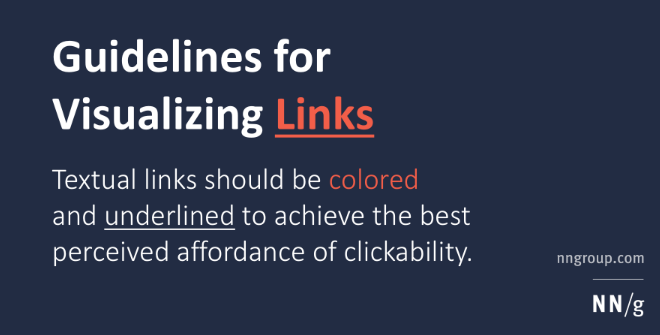
Textual links should be colored and/or underlined to achieve the best perceived affordance of clickability, though there are a few exceptions to these guidelines. Always color and underline the link text. Users shouldn’t have to guess or scrub the page to find out where they can click.

Example of Error:

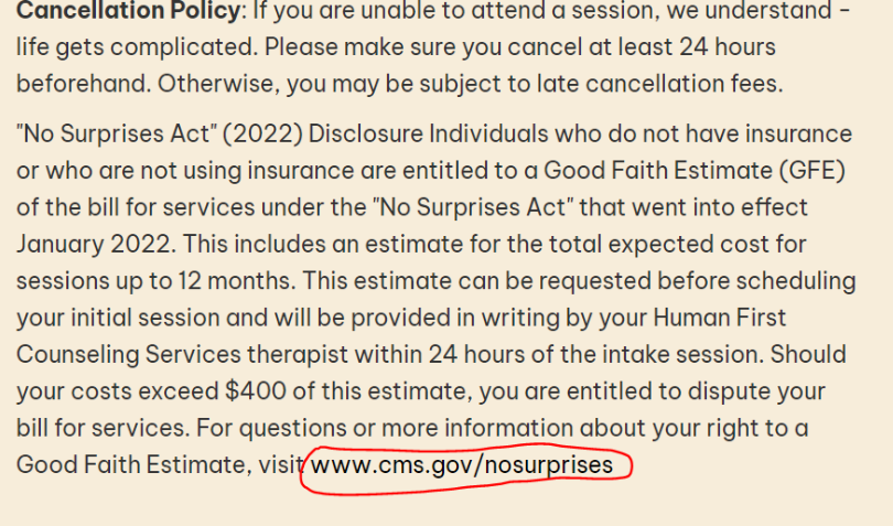
Here the text is only slightly darker from the surrounding text, and not underlined. Thus, is barely distinguishable as a link, and would be considered an error.
Other Guidelines for hyperlinks:
- Assuming the link text is colored, it’s not always absolutely necessary to underline it.
- There are two main cases in which you can safely eliminate underlines: navigation menus and other lists of links. However, this is true only when the page design clearly indicates the area’s function. (Remember: your design might not be as obvious to outside users as it is to your own team members.) Users typically understand a left-hand navigation rail with a list of links on a colored background, assuming it resembles the navigation areas on most other sites.
- Exception: underlined links are important for low-vision users’ accessibility, so retain underlines if accessibility is a priority for your site or you have many users with low vision.
- Don’t underline any text that’s not a link, even if your links aren’t underlined. Reserve underlining for links. Because underlines provide a strong perceived affordance of clickability, users will be confused and disappointed if underlined text doesn’t have an actual affordance to match this perception.
- Use different colors for visited and unvisited links.
- The color for unvisited links should be more vivid, bright, and saturated than the color for visited links, which should look “used” (dull and washed out).
- The two colors should be variants or shades of the same color, so that they’re clearly related. Using drastically different colors (say, orange and green) makes it hard for users to understand the relationship between the two types of links and to identify which color is the “used” version of the other.
- Shades of blue provide the strongest signal for links, but other colors work almost as well.
- As always, when using color to signal information, you should provide redundant cues for color-blind users. Making unvisited links brighter and more luminous than visited links will usually accomplish this goal.
- Never show text in your chosen link colors unless it’s a link.
- You should generally avoid color for text unless it’s a link. However, assuming it differs from the link color, you can sometimes use colored text without causing major usability problems. For example, in a checklist summary, you could show the word “okay” in green and the word “error” in red. (The fact that the word meanings are clearly different provides the required redundant cue for color-blind users.)
- Don’t use blue for non-link text, even if you don’t use blue as your link color. Blue is still the color with the strongest perceived affordance of clickability.
- There is no need to use special colors or other visualizations when the cursor hovers over a link. Doing so only makes the page appear more cluttered as the user moves the mouse across the screen.
- Exception: if you’ve opted to present links with less than the maximum perceived affordance for clickability, you can recover some of the lost usability by signaling clickability when the user hovers over the link. For example, if your links aren’t underlined, you can make an underline appear while hovering.
- In any case, don’t use bold-facing as a hover effect, because making the font wider may cause the text to re-align.
- One useful hovering effect is to use link titles to help users predict where a link will lead before they click it. (If you’re using a mainstream browser, you can see this effect by hovering over the links in this column.)
- Don’t use tiny text for links. Don’t place links so close together that users with reduced motor skills will have difficulty selecting them. These guidelines are particularly important to ensure usability for older users.
- Exception: It’s okay to use small font for links that few users will need (such as copyright info), as long as you place those links in a secondary location (such a footer) so users don’t feel obligated to read them.
- If you target seniors or otherwise have many older users, ensure that your links appear in a big font (12 points or higher) and that links include enough text to make them easy to click on.
These guidelines all relate to the textual link appearance. It’s even more important that you carefully choose the link content (the actual words), but that’s another topic.
Source for standards nngroup.com
