Key Components of an Effective Multi Product Homepage
For Stores with Categories, Product Variants, and Broad Inventories
Capture: Hero Section
Get attention and emotional orientation
Purpose
- Grab attention and immediately orient the visitor. Communicate what your store offers, who it's for, and why it matters—all within the first scroll. The goal is brand-level value communication, not just one product pitch.
Content
✅ Clear, Benefit-Led Hero Messaging
- Use a bold headline that speaks to the store’s overall promise or value prop.
- Example: “Performance Apparel for Any Season” or “Clean Beauty for Every Skin Type.”
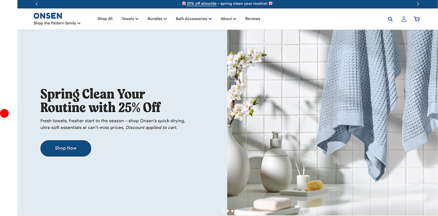
- Visual Example: Onsen’s headline “Spring Clean Your Routine with 25% Off” communicates not just a sale, but a transformation—an emotional hook tied to fresh starts, which aligns with towels, bath accessories, and bundles.
✅ Category Access Points in the Hero
- Include buttons or tiles that link directly to core collections.
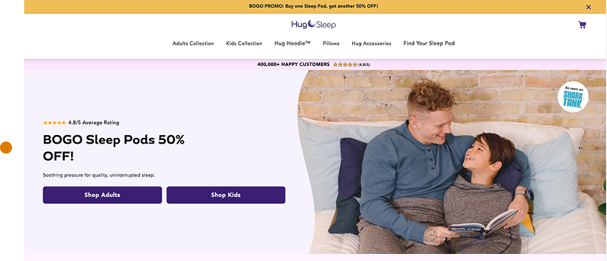
- Visual Example: “Shop Adults | Shop Kids | Shop Accessories” or “By Skin Type | By Concern.”
✅ Strong Visuals that Reflect Your Audience
- Use lifestyle imagery with diverse representation that reflects your target customers.
- Avoid a generic single-product hero in favor of visuals that capture brand experience.
- Visual Example: Onsen’s hero imagery shows their towels in a peaceful bathroom scene with complementary accessories, creating a calm, elevated self-care vibe. The product is contextualized—not isolated.
- Visual Example: Hug Sleep shows a parent and child cuddled up in their Sleep Pods, smiling and reading together.
✅ Seasonal or Promotional Banner Strip (Optional)
- If you run active promos, add a top-of-page strip for urgency (e.g., “Free Shipping Over $50 | New Fall Arrivals”).
❌ What to Avoid
- Using a product-focused hero that fails to communicate the store’s broader value
- Leading with generic language like “Welcome to Our Store” or “We Sell Quality Products”
- Failing to immediately show who the store is for (missing identity cues)
- Visual clutter or text layered over unreadable background images
- No emotional hook—just technical or product info with no context
Research
- Users form brand trust impressions within 2.6 seconds—visual layout and messaging hierarchy are key. (Stanford Web Credibility Project)
- CTAs in the first viewport increase CTR by 70% compared to CTAs placed below the fold. (CXL)
- Benefit-focused headers are 2x more effective than clever, brand-only slogans. (Baymard)
Clarify: Product Overview & UVP
Help the user understand structure, product range, and navigation
Purpose
- Help visitors understand what you sell, how it’s organized, and where to go next. It’s about fast, frictionless orientation—especially critical in stores with many categories or product types. Help the user understand structure, product range, and navigation
Content
✅ Shop-by-Category or Use Case Blocks
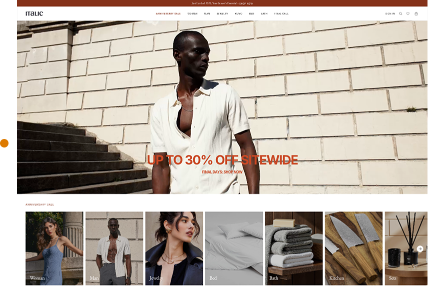
- Present clear, clickable cards like “For Sleep,” “For Energy,” “For Pets,” “By Age,” or “By Room.”
- Visual Example: Italic uses “For the Bedroom,” “For the Kitchen,” and “New Arrivals” blocks above the fold.
✅ Visible Navigation with Specific Labels
- Avoid generic “Shop” links. Use top-level nav items like “Face,” “Body,” “Hair” or “Tools,” “Clothing,” “Accessories.”
✅ Prominent Search Bar or Icon
- Place the search bar top-right or centered. Enable smart suggestions with product names or collections.
✅ Collection Preview Rows
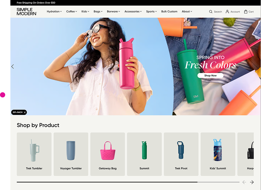
- Show 4–6 featured items from top categories like “Best Sellers,” “Under $25,” or “Top Rated.”
- Visual Example: Simple Modern showcases water bottles in various collections (“Kids,” “Tumblers,” “Personalized”) right from the homepage.
❌ What to Avoid
- “Shop All” as the only path to products—no category segmentation
- Ambiguous or branded category labels like “Essentials,” “Experience,” or “Collections”
- Dropdowns overloaded with 10+ items, or nested levels that require precision clicking
- Hiding core nav inside a hamburger menu on desktop
- Search bars with poor autocomplete or zero-result dead ends
Research
- 43% of users head straight to search; bad search UX causes bounce (Baymard)
- Exposed navigation improves product findability by 40% (NN/g)
- Clear category naming increases conversion rates by 25–30% (Baymard)
Connect: Emotional Appeal & Social Proof
Build trust and emotional alignment
Purpose
- Establish credibility, relatability, and brand affinity. This is where the store moves from being useful to being trustworthy. In a multi-product environment, Connect is often brand-level, not just product-specific.
- Think: “Do I like these people?” “Do I believe their claims?” “Do I trust their taste?”
Content
✅ Real Testimonials with Specific Outcomes
- Highlight short, specific reviews tied to real benefits. Go beyond generic praise—focus on what changed for the customer. Use names, photos, or locations to build trust.
- Include a mix of:
-
- Problem-to-solution quotes (e.g., “Helped with my eczema in a week.”)
- Routine-based praise (e.g., “I drink the sleep tea every night.”)
- Category-specific wins (e.g., “Best tool set I’ve used for home repairs.”)
- Place them near CTAs or collection blocks, not just in carousels. In-context testimonials are more likely to influence behavior.
-
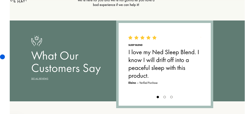
- Visual Example: Ned uses testimonials organized by need: “I sleep better now,” “Less anxiety,” “My cycle is finally regular.” Each quote is paired with a name and product.
✅ Lifestyle Photography with Relatable People
- Use imagery that shows your products in context with people that reflect your target demographic—not just polished models or flat lays.
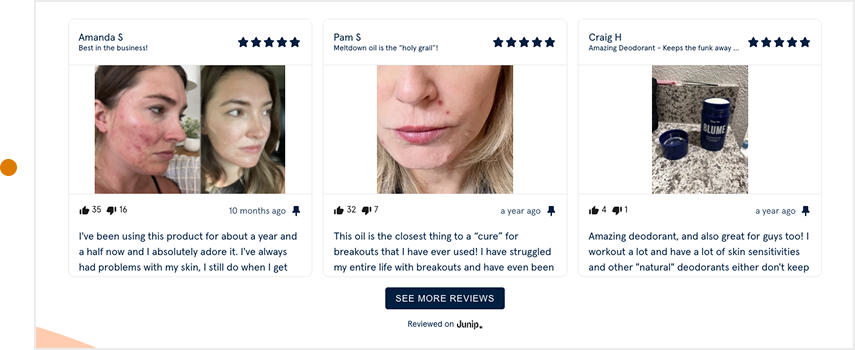
- Visual Example:Blume- features real customer-submitted photos throughout its homepage and product pages. You'll see teens and young women using their skincare in bedrooms, bathrooms, and dorms—exactly where their audience lives. It feels intimate, authentic, and grounded in real use.
✅ Founder Story, Brand Mission, or Ethos Section
- Include a brief “why we exist” or “what we stand for” section mid-page or just above the footer. It helps people align with your values beyond the transaction.
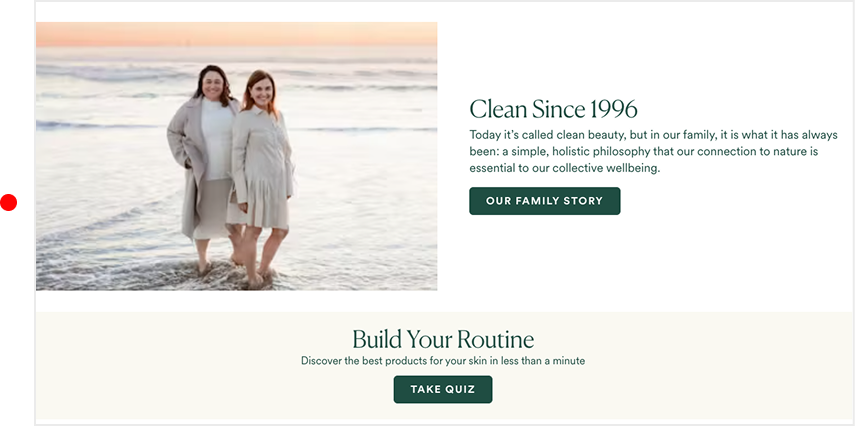
- Visual Example: OSEA Malibu features a dedicated brand story section titled “Clean Since 1996” mid-homepage. It explains how the founder was inspired by her grandmother’s connection to the sea and her own mission to create clean, safe skincare. Paired with ocean imagery and real family photos, the story reinforces OSEA’s long-term authenticity and commitment to sustainability.
✅ Social Proof Blocks: UGC, Badges, Press Mentions
- Dedicate a row or module on your homepage to quick, scannable proof that real people love your products and that your brand has external credibility. This isn’t just about reviews—it’s about signaling trust at scale, fast.
- These blocks can include:
-
-
- star ratings with review counts
- “As Seen In” media logos (e.g., Vogue, GQ, Shark Tank, NYT)
- Screenshots of Instagram posts or TikToks
- Customer-submitted images with short quotes
- Industry certifications or awards (B Corp, EcoCert, Woman-Owned)
-
-
- Visual Example: Hug Sleep includes a Shark Tank badge, star rating, and press coverage right near their hero. That adds instant validation.
❌ What to Avoid
- These disconnect the user emotionally. They make the store feel cold, vague, or generic.
- “Generic reviews like “Love it!” with no context or connection to a product or outcome
- Stock photos with unrealistic lighting, demographics, or poses
- Hiding trust content in the footer or on a separate "About" page
- Using a testimonial carousel with auto-scroll only—kills scanability and control
- Telling a brand story without showing how it relates to the customer
Research
- 92% of customers trust user-generated content over brand-produced visuals (Stackla)
- Adding real customer faces to testimonials increases trust by 35% (CXL Institute)
- Trust sections placed mid-page see 29% higher retention than those buried in footers (NN/g)
- Testimonials with specific product benefits increase conversions by 14–21% (Baymard)

Convince: Product Details, Offers, & Urgency
Overcome doubt and reinforce belief
Purpose
- Answer the unspoken question: “Why should I buy from this store?” In multi-product eCommerce, Convince isn’t about one product—it’s about believing in the store itself. This section addresses price resistance, quality skepticism, comparison shopping, and logistical friction.
Content
✅ “Why Shop With Us” Section with Icons or Short Text Blocks
- “Use 3–5 key brand-level differentiators with visual icons. Prioritize ones that mitigate risk or highlight superiority.
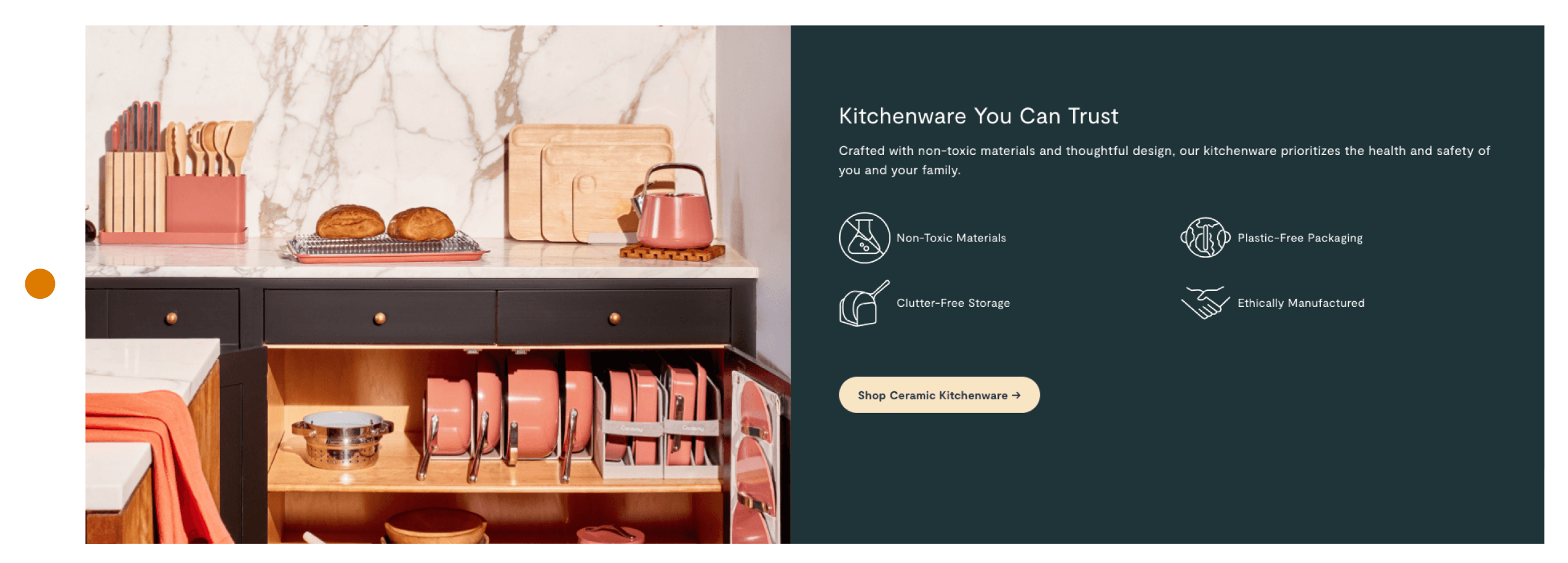
- Visual Example: Caraway, a DTC cookware brand, includes a well-designed icon row on their homepage with standout points like:
- Non-Toxic Materials
- Plastic-Free Packaging
- Ethically Manufactured
- Clutter-Free Storage
- This icon block appears high on the homepage and is repeated near product rows, reinforcing trust exactly when purchase decisions are being considered.
✅ Transparent Quality or Sourcing Claims
- Explain what makes your products worth buying—materials, origin, process, or testing. Visuals or illustrations help.
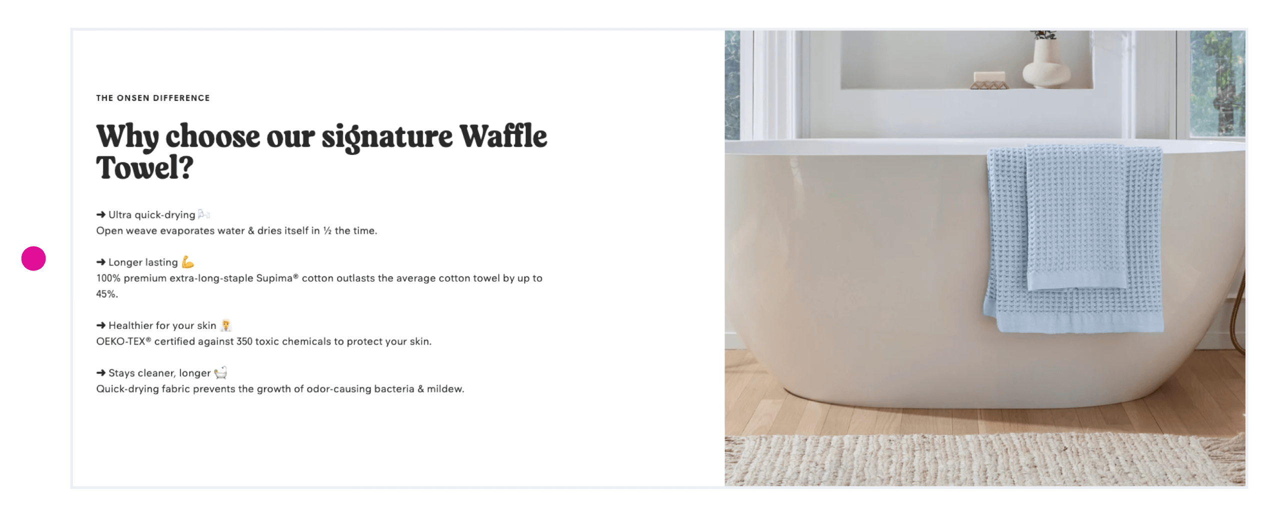
- Visual Example: Onsen showcases its proprietary towel weave and quick-dry fabric. They tell you why it feels better and why it lasts longer.
✅ Price/Value Framing or Comparisons
- Whether you're premium or budget-friendly, you need to help shoppers justify the price. This isn’t about discounts—it’s about showing why the cost makes sense.
- You can frame value through:
- What it replaces (e.g., “One product replaces 5 others”)
- How long it lasts (e.g., “Built to last 10 years”)
- What’s included (e.g., “$74 value for $59”)
- Smarter ownership (e.g., “Refills cost less than rebuys”)
- The goal is to make customers feel like they’re making a smart, efficient decision, not just a purchase.
- Even without visual comparisons, strong copy and pricing context can move hesitant users closer to checkout.
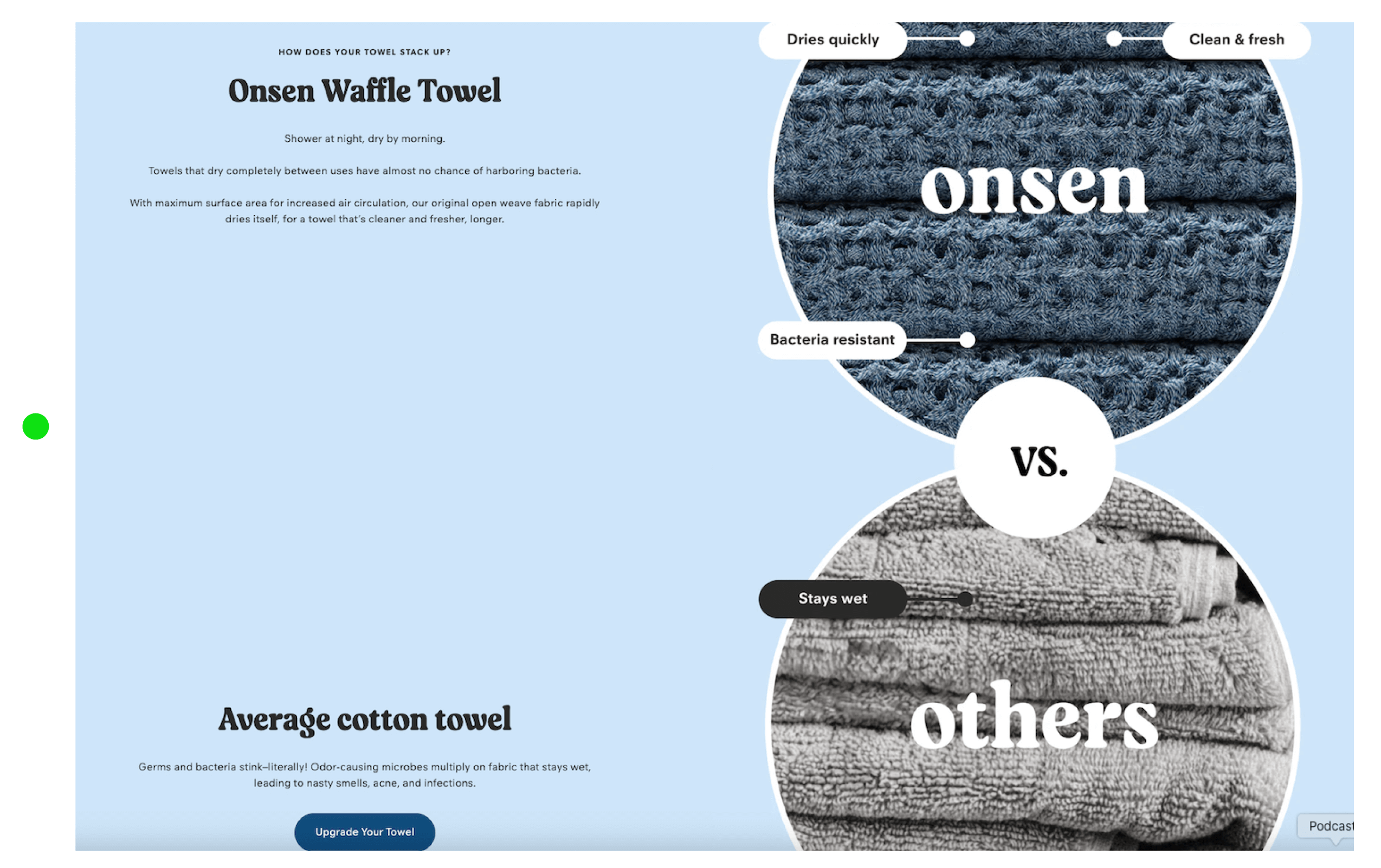
- Visual Example: Onsen showcases its proprietary Waffle Towel and compares it to the average cotton towel with clear visuals and benefits
✅ Trust Signals: Guarantees, Shipping Policies, Support Access
- List things like “30-day free returns,” “Fast shipping from the US,” or “Live support.” Make these visible, not buried.
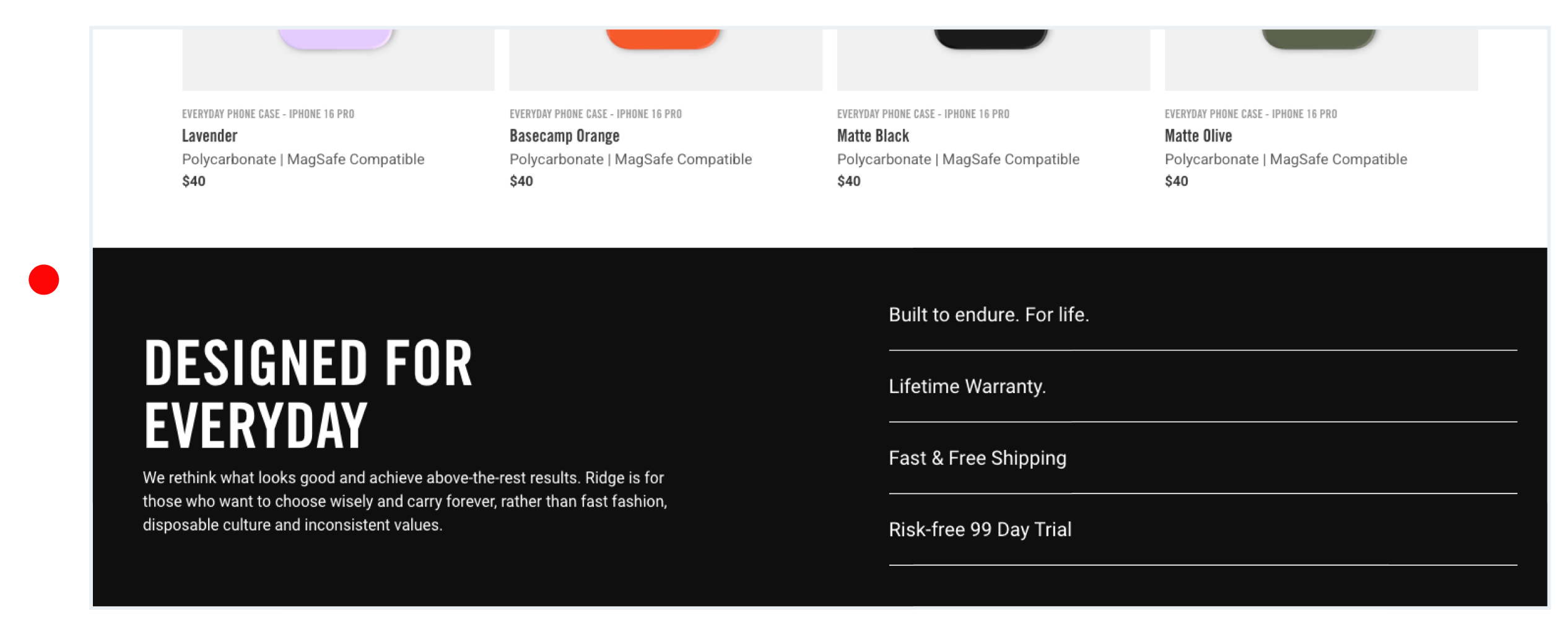
- Visual Example: Ridge Wallet has a visual block that says “Try it for 99 days. Love it or return it.” This reduces purchase anxiety instantly.
❌ What to Avoid
- These fail to provide the assurance a hesitant buyer needs to make a confident decision.
- Empty slogans like “High Quality Products” with no details or proof
- Hiding shipping or return info in footers or legal pages
- Vague or overused claims like “Trusted by Thousands” without actual numbers or context
- Long, text-heavy paragraphs with no visual break—especially on mobile
- Leaning entirely on brand story to justify value (users want evidence, not just emotion)
Research
- Visible value propositions reduce cart abandonment by 22% (CXL)
- Icon-based trust rows improve content scanning by 26% and increase retention on product and homepage layouts (NN/g)
- Transparent return policy messaging improves conversion by 32%, especially for first-time customers (Baymard)
- Side-by-side brand comparisons help rationalize price premium and increase AOV by up to 15% (Baymard)
Convert: CTA Reiteration
Guide action and close the loop
Purpose
- Encourage users to take action. In a multi-product store, conversion doesn’t always mean a single product purchase—it could be browsing a collection, joining an email list, building a bundle, or starting a quiz. The goal is to offer clear, frictionless, high-intent entry points across the homepage.
Content
✅ Multiple, Contextual CTAs Across the Page
- Rather than just a single “Shop Now,” provide a variety of CTA buttons tied to specific categories, collections, and use cases.
- Use a Unique, Consistent CTA Color
- All primary CTAs should use a consistent color that contrasts sharply with the background and is not used for any other interactive elements.
- Visual Example: Three Ships is a skincare brand with a homepage that showcases clear, varied CTAs placed throughout, each aligned with a specific customer mindset:
✅ Email Opt-In with Tangible Value
- Encourage sign-ups with a real incentive: discount, early access, free shipping, exclusive guide—not just “get updates.”
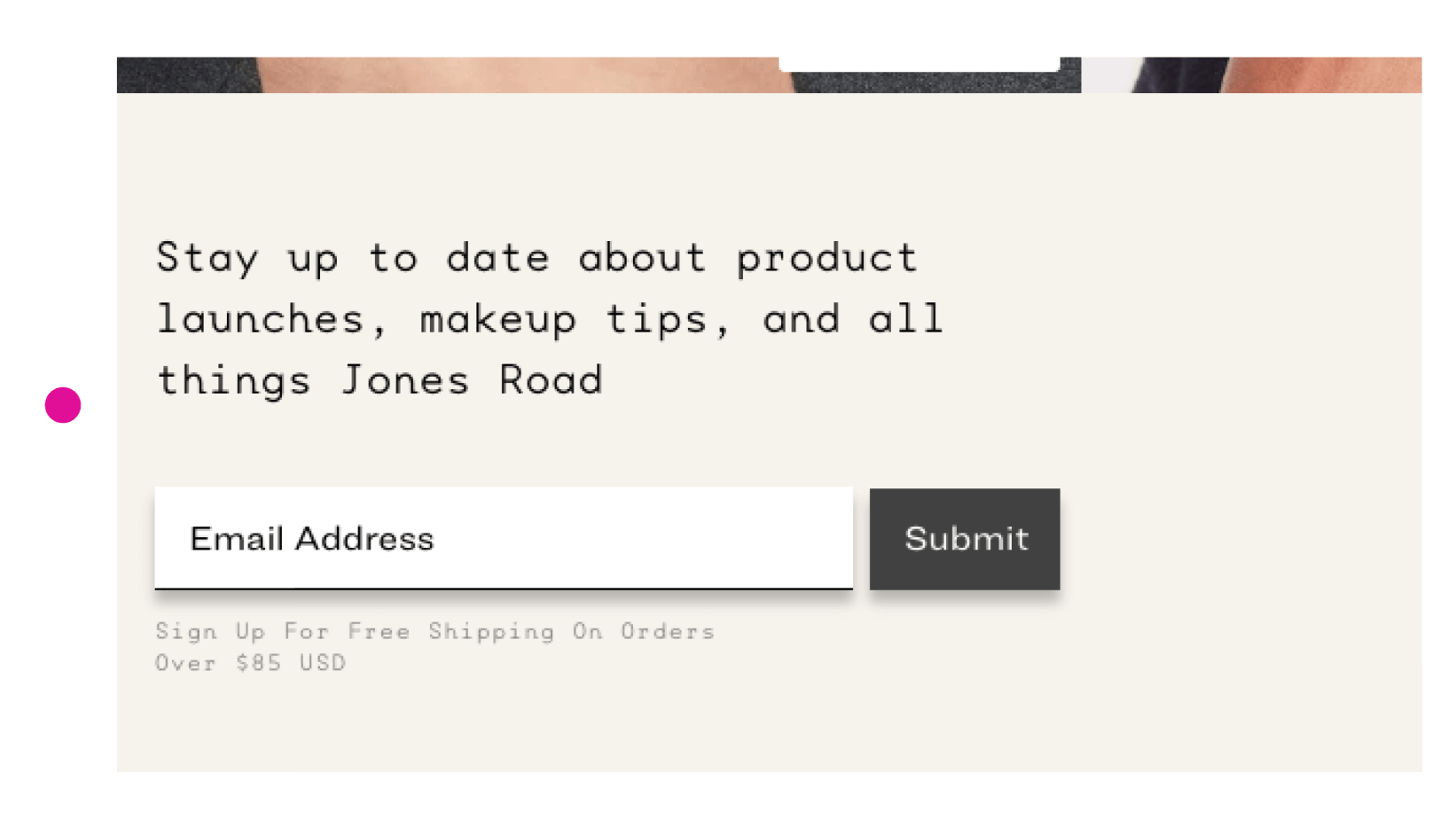
- Visual Example: Jones Road Beauty offers a free gift and a discount on shipping in exchange for an email. The opt-in block is stylish, mobile-friendly, and easy to complete.
✅ Conversion Boosters Like Bundles, Quizzes, or Gift Guides
- Highlight secondary conversion paths for people not ready to buy: starter kits, product finders, or gift builders.
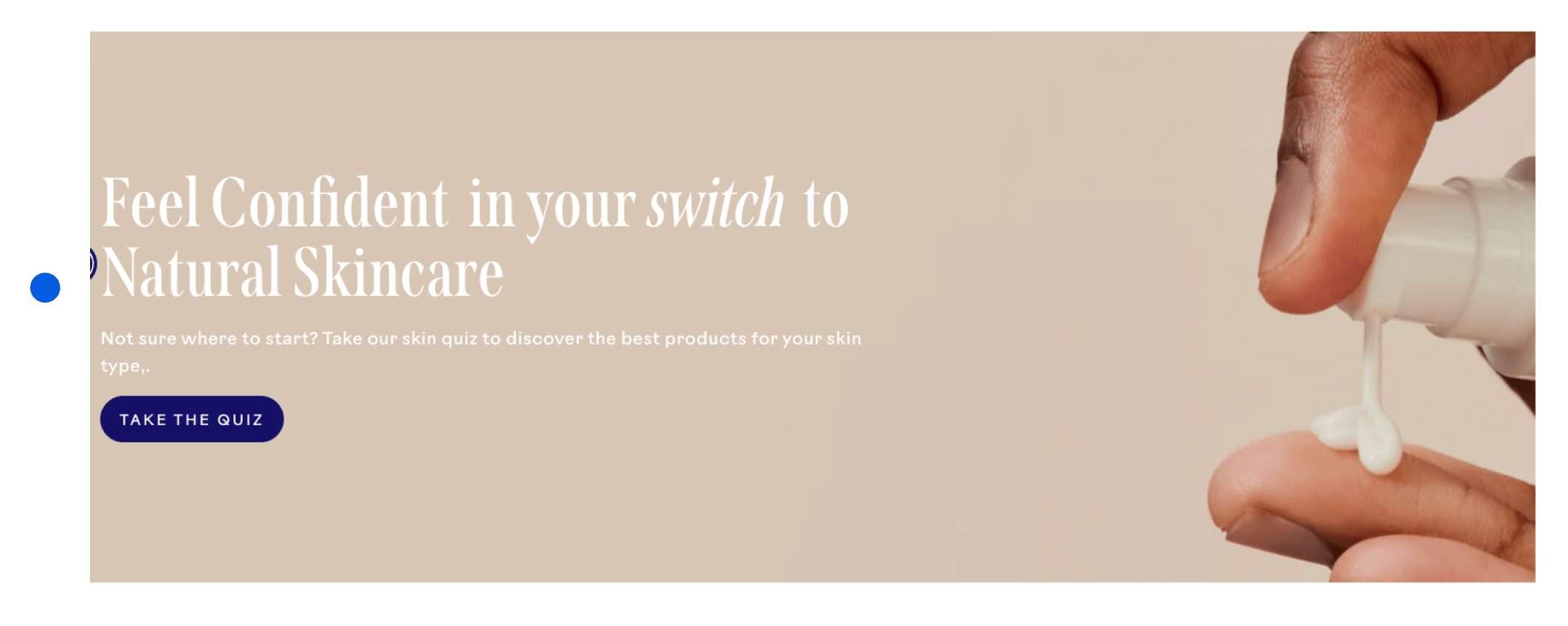
- Visual Example: Three Ships is a skincare brand has a “Take the Quiz” – interactive entry point for undecided or new shoppers
✅ Sticky Cart or Floating CTA Button
- Keep the conversion path always accessible with a sticky nav item like “Shop,” “Cart (2),” or “Start Quiz.”
- 🔍 Visual Example: Partake Foods uses a sticky free shipping progress bar that reminds shoppers how close they are to a threshold—motivating larger orders.
❌ What to Avoid
These kill momentum. They force users to work for action rather than inviting it.
- Using only one CTA on the homepage (e.g., “Shop Now”)
- Email capture with no visible incentive (“Join our newsletter”)
- No mid-page opt-in—forcing users to scroll to the footer or get interrupted by a pop-up
- Dead-end promo banners (e.g., “Save 20%!” with no linked CTA or details)
- Mobile CTAs that disappear after scroll or can’t be tapped without zooming
Research
- Layouts with 3+ CTA paths on the homepage increase conversion rates by 18–25% (Baymard)
- Incentivized email opt-ins outperform generic forms by 3–5x (CXL)
- Sticky navigation on mobile boosts cart completion by 12–16% (Baymard Mobile UX)
- Multi-path offers (e.g., quizzes, bundles, gift guides) reduce bounce by 20% on average (Baymard)
