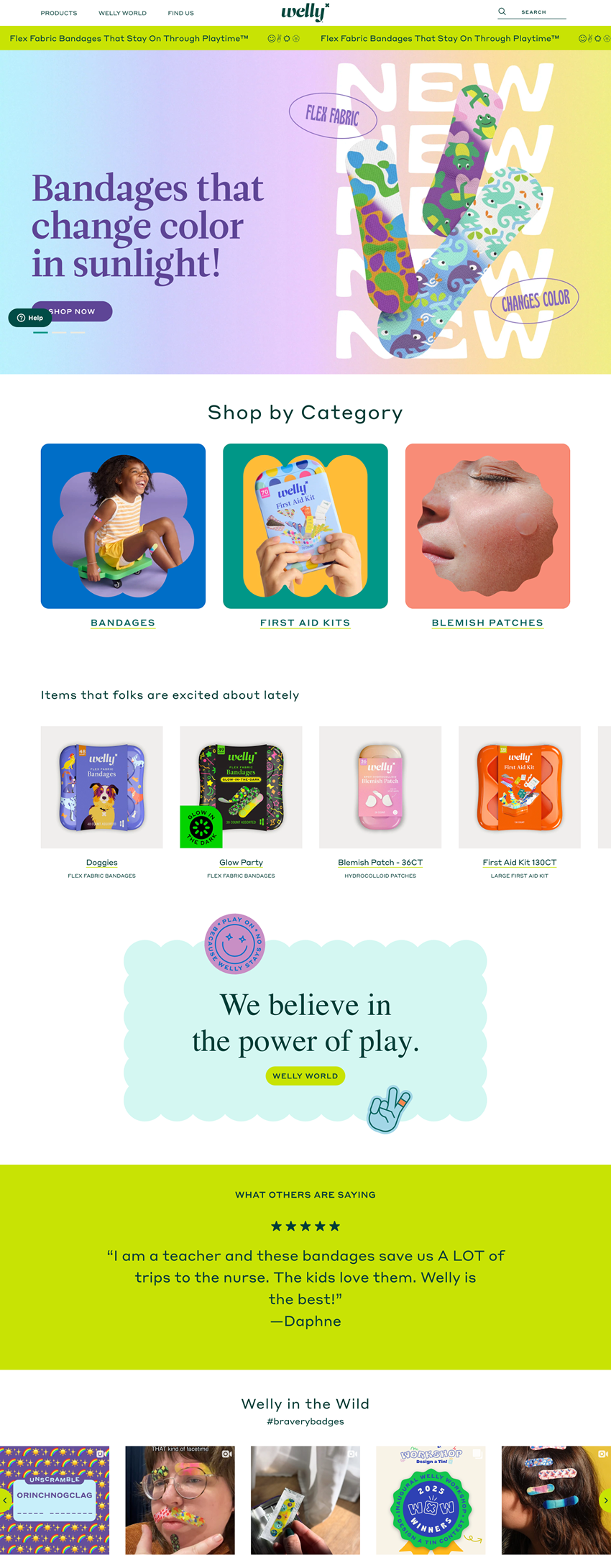
Homepage Layout for Multi-Product Store
This section helps segment homepage strategies based on product volume, catalog complexity, and purchase behavior.
Store Layout Recommendation
Best for:
- Niche direct-to-consumer brands with a focused mission (e.g., 5–10 signature products)
- Single-founder businesses or lifestyle startups
- Brands selling a few standout SKUs in multiple variants (e.g., colors, scents, sizes)
- New stores that want to build connection and trust before pushing deep catalog
Examples of who this is for:
- A skincare brand with 8 hero products
- A home fragrance company with candles, diffusers, and bundles
- A coffee brand offering 3 core blends with subscriptions
✅ Recommended Layout:
Hero Row
- Lead with a bold, benefit-driven headline and a clear, unique product visual. CTA should speak to category or product action
- Visual Example: Welly uses a visually distinct, product-forward hero with benefit-first copy (“Bandages that change color in sunlight”) and a prominent CTA.
Shop-by-Need or Collection Grid
- Immediately show the structure of your store using clickable image tiles (e.g., “For Kids,” “For First Aid,” “For Breakouts”). Avoid hidden navigation or relying solely on the menu.
- Visual Example: Welly presents three bold, visual tiles right below the hero: “Bandages,” “First Aid Kits,” and “Blemish Patches,” clearly segmenting the product ecosystem.
Lifestyle/Story Row
- Add a row that introduces your ethos or brand personality. Ideally includes a CTA to “Learn More” or “Explore Our Story.”
- Visual Example: Welly features a values-driven message: “We believe in the power of play,” paired with a CTA to explore the “Welly World” content hub.
Product Carousell
- Top-rated or editor picks
Opt-In or Promo Row
- Use a mid-scroll incentive-based opt-in (discount, gift, first access) to build list growth without relying on pop-ups.
- Visual Example: Welly places email sign-up in the footer—visible, but could be stronger. Still, the rest of the homepage does the trust-building work effectively.
User Generated Content/Testimonial Row
- Use real customer quotes or a social feed to show proof of satisfaction. Images + text work best.
- Visual Example: Welly features a bold quote in a standalone row: “I am a teacher and these bandages save us A LOT of trips to the nurse…” with star ratings and attribution. It’s direct, relatable, and credible.
- Visual Example: Welly finishes with a social carousel labeled “Welly in the Wild” using UGC and their branded hashtag (#braverybadges), paired with customer photos.
✅ UX Priorities
- Minimize friction by limiting options
- Focus on visual storytelling to build emotional resonance
- Use CTAs that map to key categories rather than “Shop All”
Why this layout works
- Each row has one clear job: orient, inspire, sell, or build trust
- The layout avoids dead space, cluttered menus, or unnecessary modules
- Welly proves that even a playful, youth-oriented brand can execute structure with clarity
- Product range is focused, and the homepage reflects that—not pretending to be a catalog
- The 5 C’s are naturally woven in: grabbing attention, structuring the experience, building emotional appeal, providing trust signals, and offering easy paths to action

