Skip to content

Design Practices V2

Layout Consistency

Margins and Padding

Use consistent margins and padding across all elements to create a cohesive layout.

Maintain enough spacing between content blocks to enhance readability and visual hierarchy.

Avoid overcrowding or excessive white space to balance aesthetics and functionality.

Source: W3schools
Source: W3schools

General Styling Rules

Use grid systems to maintain alignment and structure.

Ensure adequate negative space to improve focus and readability.

Create visual consistency by using predefined styles for headings, text, and images.

Optimize for responsiveness to ensure designs adapt seamlessly across devices.

Alignment and Balance

Consistency in Alignment
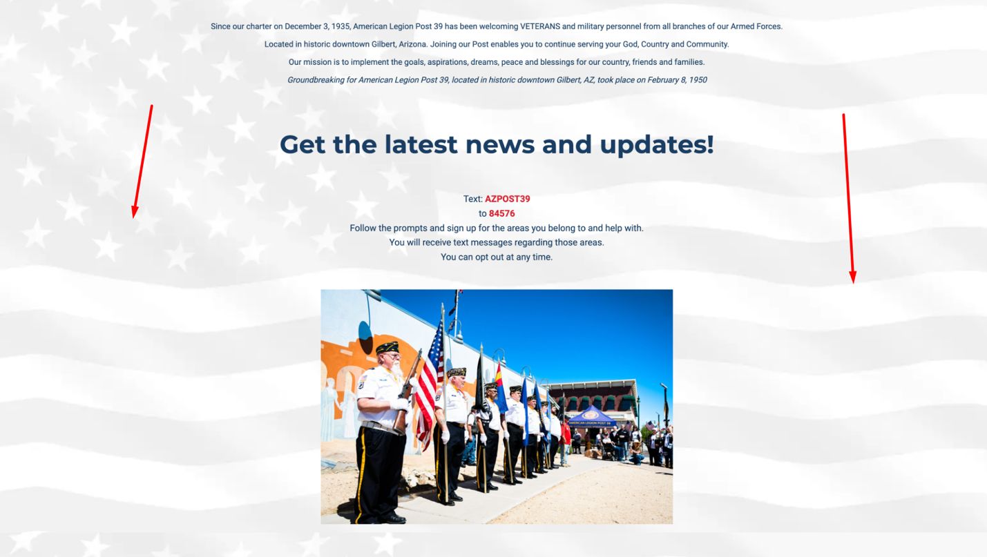
Align text and images consistently to establish a polished, professional look.

Avoid mismatched alignment between elements; all sections should follow the same grid or guide.

Example of inconsistent spacing
Example of consistent spacing

Creating Balance
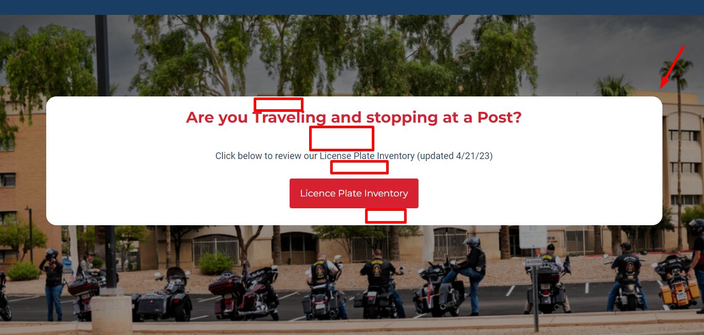
Distribute content evenly to avoid cluttered or uneven layouts.

Utilize symmetry or deliberate asymmetry to guide the viewer's attention effectively.

Maintain proportional scaling for images and text to ensure visual harmony.

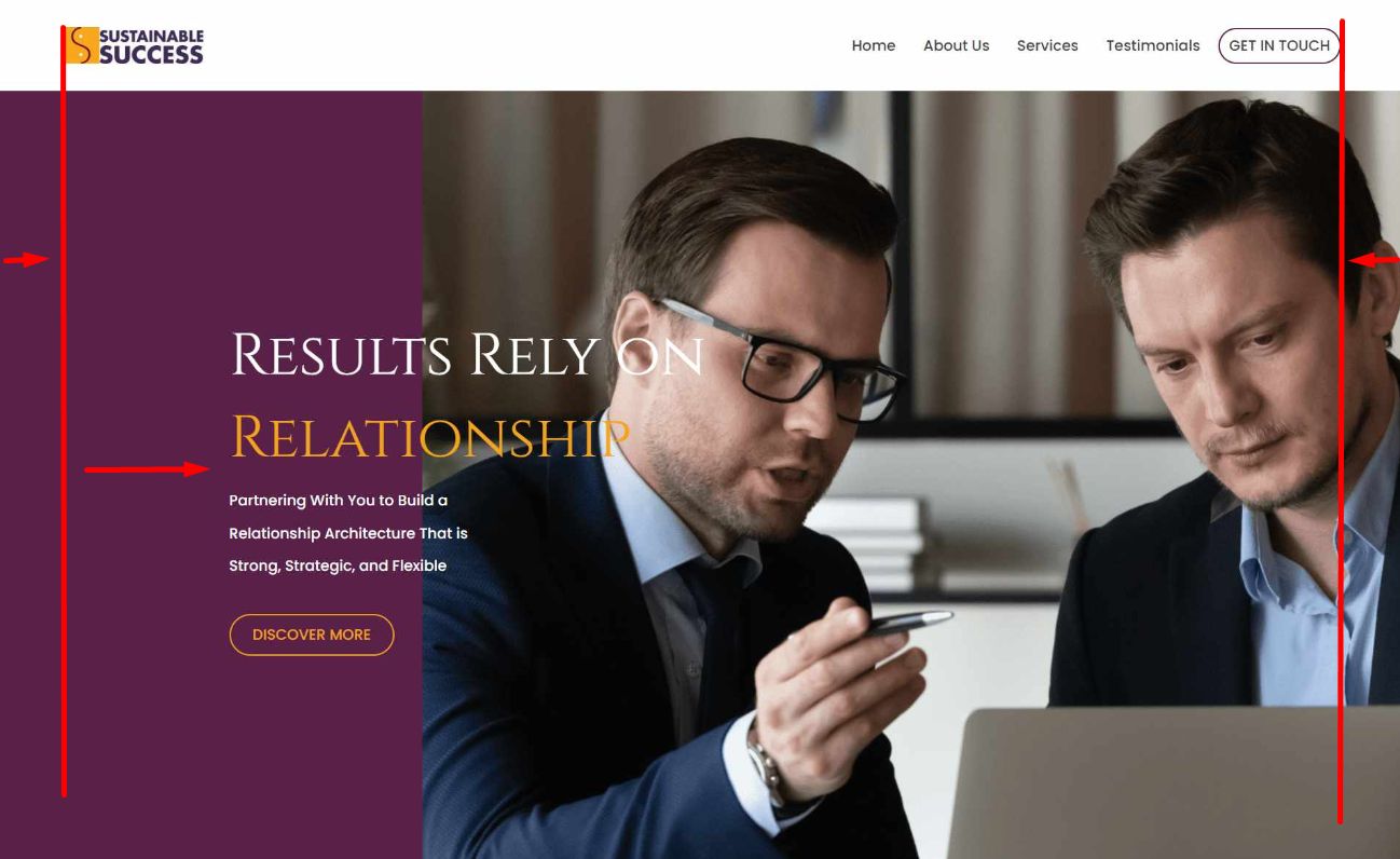
An example of poorly alignment
An example of good alignment

Branding Consistency

Styling Modules

Adhere to brand guidelines for typography, color schemes, and iconography.

Avoid mixing styles that could dilute brand identity.

Use consistent button styles and form designs to reinforce the brand's visual language.

Maintaining a Unified Look

Regularly test designs for cohesion and adherence to branding standards.

Apply consistent styles across all pages, including headers, footers, and content sections.

Ensure uniform usage of icons, logos, and visual elements.

Row Styling

Effective Row Design

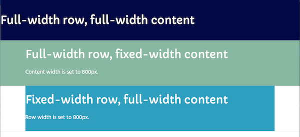
Use full-width rows strategically to create impactful visuals.

Incorporate contrasting background colors or textures to differentiate sections.

Avoid overuse of decorative elements that distract from the core content.

Source: Beaver Builder Knowledgebase - Row layouts

Responsiveness
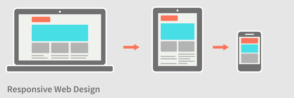
Test row designs on multiple devices to ensure optimal usability.

Use adaptive row padding and margins to enhance mobile experiences.

Responsive design
Responsive design

Using Rows

Use separate rows to organize content for clarity and readability.

Highlight key elements by placing them in distinct rows.

Ensure each row has a clear purpose, whether it’s to emphasize, separate, or create transitions.

Site content with a lot of empty spaces
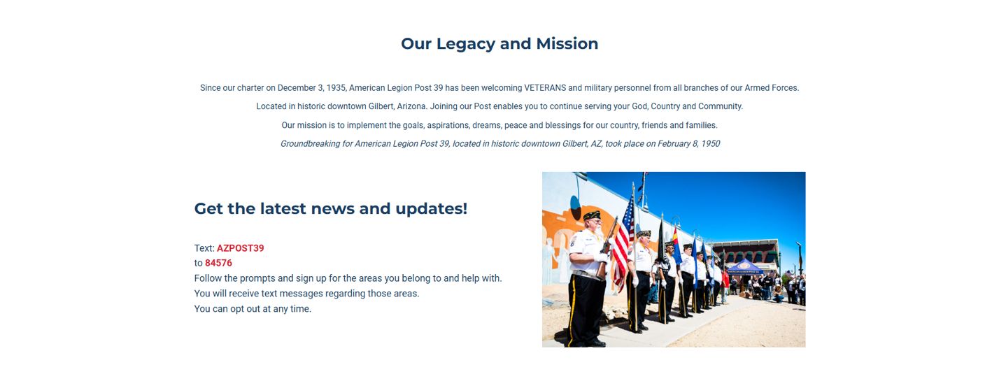
Well organized content section

Row Backgrounds

Image Backgrounds

Choose high-quality images that scale well across devices.

Avoid cluttered or overly busy backgrounds that obscure content.

Utilize subtle overlays to enhance text legibility over images.

Example of image background row

Patterns and Textures

Use patterns or textures sparingly to avoid visual clutter.

Ensure they complement the overall design theme and don’t distract from key content.

Image Separators

Image separators
Image separators

Incorporate image separators to add visual interest between sections.

Use transparent backgrounds to blend seamlessly with the layout.

Align separators with brand aesthetics for cohesion.

Example of image separator usage

Accessibility Best Practices

Contrast Ratios: Ensure sufficient contrast between text and background colors for readability by users with visual impairments.

Poorly contrast ratio
Good contrast ratio
Good contrast ratio

Keyboard Navigation: Design interactive elements to be accessible via keyboard navigation.

Alt Text for Images: Provide descriptive alt text for all images to aid screen readers.

Scalable Text: Use relative units (e.g., `em` or `rem`) for font sizes to allow text resizing without breaking the layout.

Performance Optimization

Minimized Assets: Optimize images, CSS, and JavaScript files to reduce page load times.

Lazy Loading: Implement lazy loading for images and other resources to improve initial load performance.

Responsive Images: Use `srcset` attributes to deliver images optimized for the user’s device resolution and size.

CDN Usage: Leverage content delivery networks (CDNs) to speed up resource delivery.

*Recommendations in this section are general guidelines and may not apply to every build. They can vary based on specific customer requests or the nature of the service being provided.

User Experience (UX) Enhancements
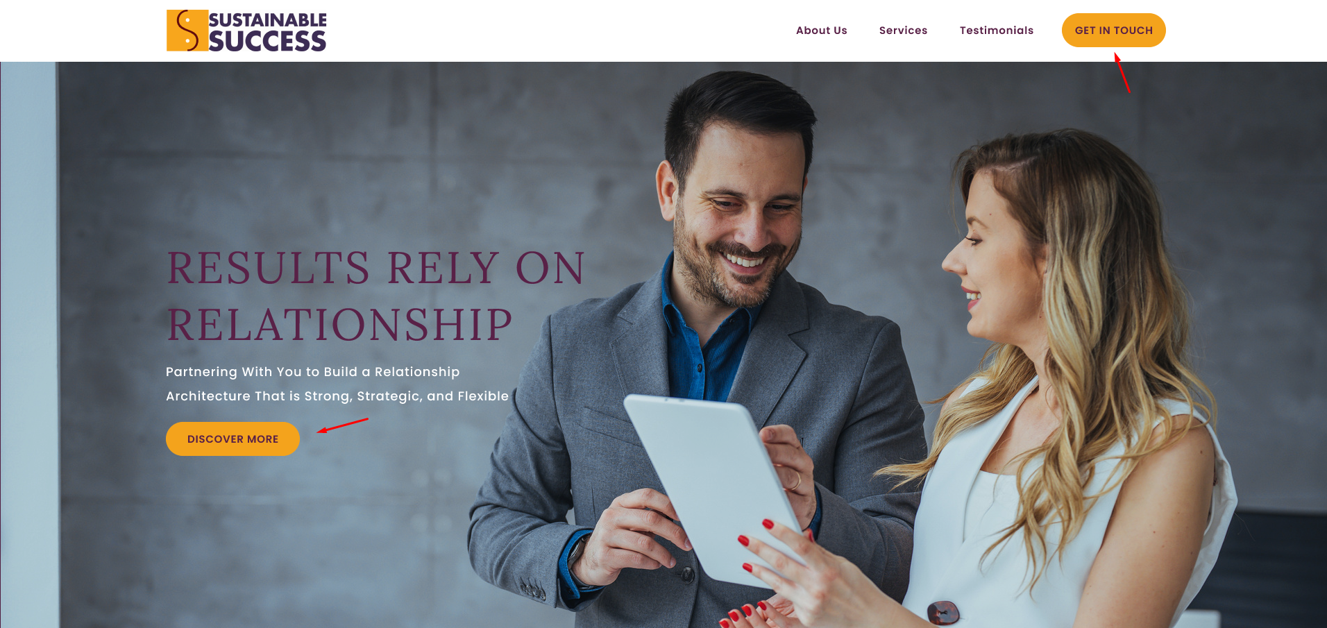
Call-to-Action (CTA) Placement: Ensure CTAs are prominently placed and easily accessible.

An excellent example of the strategic placement of primary and secondary calls-to-action (CTAs)

Feedback Mechanisms: Include visual feedback (e.g., button animations) to indicate interactive elements.

Error Messaging: Provide clear, user-friendly error messages for forms and processes.

Intuitive Navigation: Use breadcrumbs, sticky menus, and consistent navigation patterns for a seamless experience.

*Recommendations in this section are general guidelines and may not apply to every build. They can vary based on specific customer requests or the nature of the service being provided.

SEO-Friendly Design

Semantic HTML: Use proper semantic elements (`<header>`, `<article>`, `<footer>`) for improved search engine understanding.

Mobile-First Design: Prioritize mobile layouts and optimize for touch interactions.

Structured Data: Implement structured data (e.g., Schema.org) for rich search engine results.

*Recommendations in this section are general guidelines and may not apply to every build. They can vary based on specific customer requests or the nature of the service being provided.

Animation and Interactivity

Subtle Animations: Use animations sparingly to draw attention without overwhelming the user.

Interactive Elements: Include hover effects, toggles, and expandable sections for an engaging experience.

Performance Testing: Ensure animations and interactions do not hinder page performance.

*Recommendations in this section are general guidelines and may not apply to every build. They can vary based on specific customer requests or the nature of the service being provided.

Table of Contents
    Scroll To Top