The Logo
Place the logo in a prominent position, like the top left or center, ensuring it is large enough to be recognizable, with clear space around it to avoid clutter. Make it clickable to return to the homepage, align it with the brand’s style and colors, and ensure it scales well for all d
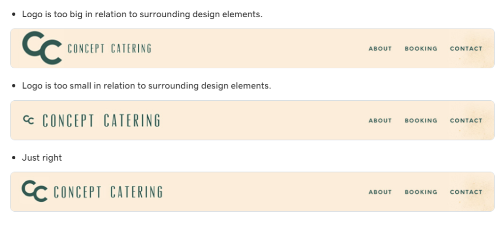
Logo Size
Avoid making the logo too small, where it becomes hard to recognize, or too large, where it dominates the header.
The ideal height of a logo in a header typically ranges between 40-100 pixels, depending on the overall design of the website, the logo’s aspect ratio, and the header layout.
If the logo is detailed and too large to use in a slim header, consider overlapping the logo with the hero section. See below:

Contrast
Don’t place the logo against a background color that makes it difficult to see. Ensure there is enough contrast between the logo and its background.
Clutter
Avoid placing too many elements near the logo that compete for attention or make the header look crowded.

Logo may need to be cropped
- If the logo elements are not fitting well within the header, they should be reformatted to fit cohesively.
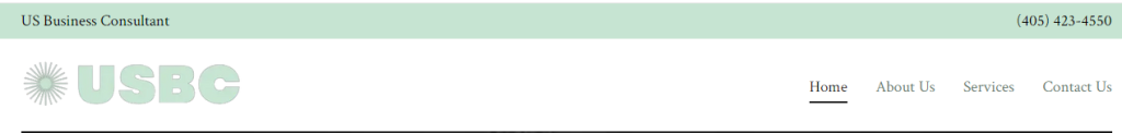
- Example: In this instance, the business contact information could have been cropped to allow for the logo to display larger in the header. Due to the scripted style of the logo, bigger size allows for better visibility.
- The logo tagline, domain name, or other unnecessary text should be cropped from the logo
- This is especially true when the text is unreadable or causes unnecessary clutter in the header
- If the logo tagline is removed, it should be placed elsewhere on the site (i.e. the hero image, the h1, heading below the hero, etc.)
Example: The tagline in the logo is not legible and needs to be cropped and placed somewhere else.